Friday, March 25, 2011
Psychedelic Album Art
I once joked that I can tell how awesome an album is going to be based on how illegible the album's title is on it's cover. If this sounds weird, it's because most of the albums I consume are from the psychedelic era. Here are some examples of records from my collection with totally over-the-top cover art and creative (if completely unreadable) examples of typography. This post is probably inspired by my recent review of the work of Marian Bantjes, who has admitted to being influenced by the art and design of the late 60s.
From the top:
The Incredible String Band, The Five Hundred Spirits or The Layers of the Purple Onion (Elektra, 1967)
SRC, Self-titled (Capitol, 1968)
Elyse, Self-titled (Tetragrammaton, 1968)
Pisces, A Lovely Sight (Reissue on Numero Group, 2009)
The Tiffany Shade, Self-titled (Mainstream, 1968)
Wednesday, March 23, 2011
Marian Bantjes Review on TCA
A review I wrote of the Marian Bantjes exhibition was just posted on Toronto Craft Alert. Check it out here.
For more information on the show at Onsite (at) OCADU, check out these websites:
http://www.ocad.ca/onsite
http://iwonderbantjes.tumblr.com/
Sunday, March 20, 2011
Corn Maze Performance

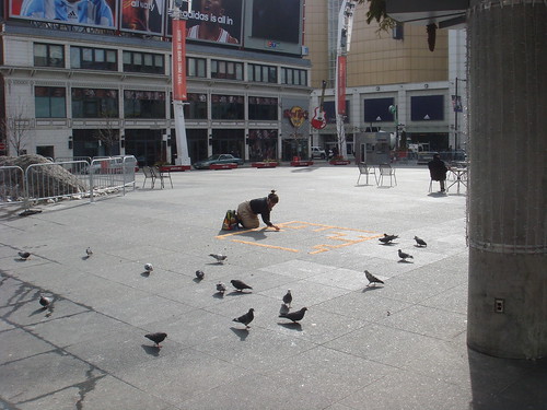
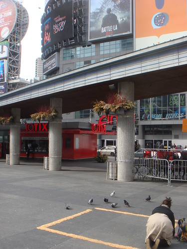
Last week, I did a performance at Dundas Square with popcorn kernels. I confess, this was an assignment for the one studio class I am taking in school this year, called Special Focus Studio: Nature, Transformation and Change. The assignment simply required that we make a piece of work that references ecological art, bio art, and uses "light, weather, animal, vegetable or mineral" as material for a work of art. Pretty familiar territory for me, I'd say!
My idea was to continue in the vein of the last piece of work for this class-- it involved a proposal for a piece of public art using cast Iroquois longhouse/greenhouse hybrid forms as a basis for three bronze sculptures across from a cluster of highrise buildings in my old neighbourhood in Scarborough. The project was rooted in ideas about urban food insecurity. I was also thinking about recent work I've done with cornsilk, specifically the corn maze quilt square I made for the Greenbelt Foundation Quilt Project, sponsored by the Ontario Craft Council. This is the short write up I did about my square, for the project's catalogue:
Corn Maze is a representation of an aerial view of a corn maze made out of the corn silk of Ontario-grown corn. Corn mazes, like berry picking, are attractions commonly linked to agritourism or “agritainment.” As a city-dweller, my experiences of the Greenbelt growing up were limited to such forms of contact with rural life. Similarly, as an adult my connection to rural Ontario is almost entirely limited to my consumption of locally grown produce. Corn Maze pokes fun at my unabashedly urban relationship with Ontario’s countryside.
In doing further research on corn mazes, I came across photos of a number of corn/hedge mazes that served as enormous advertisements for McDonalds, Husky and Chevrolet, meant to be seen aerially. To me, these rather perverse advertisements served as an apt metaphor for the omnipresence of corporate interests in the realm of food, from agriculture to food retail and brand power. Corporations mediate out experiences with food-- it is disturbing to think that such a vital, elemental part of our lives is essentially constructed and informed by corporate interests.

I knew that I wanted to make an installation in a public space that used the idea of a corn maze as it's framework. My objective was to make make a physical manifestation of this dichotomy of food experience as natural, nourishing, visceral and personal while also highly mediated. I also was thinking about the ideas surrounding my original Corn Maze quilt square-- in an urban environment, our experiences of food involve us purchasing it as opposed to growing it. How might one reconcile this distance from food's original source-- the farm, the earth-- through a performative gesture? Deciding on the right site was really important to the performance. After briefly considering laying a Corn Maze out in the parking lot of the Liberty Village location of Metro (where I do most of my grocery shopping), I decided that Dundas Square would be the best site due to it's proximity to so many billboards, signs, and for the square's general sense of insane media barrage.

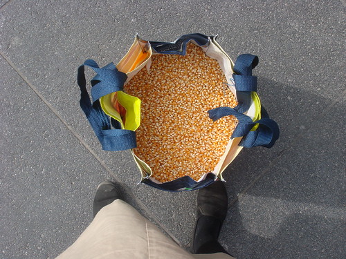
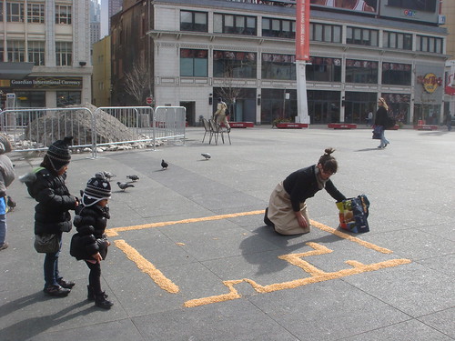
So, for my performance I made a corn maze-- modelled after a corn maze drawing I did with corn silk on Kozo paper just under a year ago-- on the ground. It ended up being about 10' X 10' large. I used a Metro reusable shopping bag to carry about 30 lbs of kernels to Dundas Square...it was insanely heavy! Being on my hands and knees for an hour was no easy task either, but the pain was eased slightly by the fact that many passers by stopped to look and chat as I was working. Children tidied my stray kernels as I worked and distracted hungry pigeons by feeding them breadcrumbs. One man-- who was awesome, and helped me clean up all my kernels with a shovel when I was done-- told me about how what I was doing reminded him of his wedding in the Philippines where coconut leaves were laid out in patterns on the ground as part of the ceremony.

There is a little more to this piece and my research for it than I will write about here. I did a bit of research on GMOs and the artwork of Costa Rican artist Lucia Madriz, who does artwork with staple foods such as corn, beans and rice. I also learned about some interesting parallel practices that are related to my installation, such as Navaho and Tibetian Sand Painting, as well as the Indian practice of Kolam, which is essentially sand painting with rice powder in order to invite birds and small insects and animals into the home in order to pay tribute to the harmonious co-existence of humans and animals. All in all, making this installation was a great experience, and it has provided me with a number of ideas for more work with corn...work that will be a little easier on the knees, at that!
More pictures of the performance can be found on my Flickr page. All photos by B. Needham. Thanks, Bo!
Saturday, March 19, 2011
School Jerks 3rd 7"
This glorious recorded artifact of the hardcore punk persuasion came out about a month ago, and the cover drawing is by yours truly. I hand-stamped the logo on about 200 of the 1000 copies that were made, too.
School Jerks' myspace can be found here.
Wednesday, March 09, 2011
Joni Mitchell Draws on the CBC, 1967
Joni talks negative and positive space with the hosts, and does a pretty groovy drawing. This is one of many very fun CBC RetroBites, scooped off of the CBC's Youtube channel.
Sunday, March 06, 2011
Marian Bantjes
Marian Bantjes is an exceptionally talented and creative designer and typographer from British Columbia. She has an exhibition up right now at Onsite (at) OCAD, that I can't recommend enough. The exhibition is at least in part in honour of her new book, I Wonder.
For more info on Bantjes, check out her website.
For more info on her OCAD exhibition, look at this.
Sunday, February 27, 2011
Shadow Box Exhibition at the TMC
I probably should have posted about this earlier, but I have a piece up in the Textile Museum of Canada's annual Shadow Box exhibition and auction right now. This is my fifth year in a row doing the event. The show us up until the night of the auction on March 3rd, so there is still a bit of time to see the work. All the work is posted online here along with all the info about the show.
Above is a photo of my rather simple piece for the show this year. It is made of garlic skin and it is called...you guessed it (or did you?)...A Breast.
Broken Pencil #50
The latest issue of Broken Pencil is out, and I am featured pretty darn prominently in the article entitled "Despite What You've Heard, Zines Aren't Dead" by talented journalista Liz Worth. The issue is a zine special, in celebration of BP's 50th issue. Big thanks to Liz for including me and making me feel so....expert-ly?
Also featured within this latest issue are neat little pieces on my pals Becky and Julie Voyce. Check it out!
Saturday, February 19, 2011
Vladimir Nabokov's Alphabet in Colour
I came across this beautiful book yesterday afternoon in a bookshop near my house. It is an illustrated alphabet by Jean Holabird of Vladamir Nabokov's descriptions of the alphabet, inspired (is that the appropriate word?) by his Synesthesia. The text included in the book is quoted from Nabokov's Speak, Memory. The book is a really interesting meditation on the senses and the ways they can intersect with one another.
The following text was scooped from the Alphabet in Colour page on the Gingko Press website:
"For anyone who has ever wondered how the colors Nabokov heard might manifest themselves visually, Alphabet in Color is a remarkable journey of discovery. Jean Holabird’s interpretation of the colored alphabets of one of the twentieth century’s literary greats is a revelation. Nabokov saw rich colors in letters and sounds and noted the deficiency of color in literature, praising Gogol as the first Russian writer to truly appreciate yellow and violet. This book masterfully brings to life the charming and vibrant synesthetic colored letters that until now existed only in Nabokov’s mind.
In Alphabet in Color Jean Holabird’s grasp of form and space blends perfectly with Nabokov’s idea that a subtle interaction exists between sound and shape. He saw “q” as browner than “k,” while “s” is not the light blue of “c,” but a curious mixture of azure and mother-of-pearl. . . . Dull green, combined somehow with violet, is the best I can do for “w.”
In his playful foreword, Brian Boyd, “the prince of Nabokovians,” points out that an important part of “Nabokov’s passion for precision was his passion for color.”
Thursday, February 10, 2011
Three Sisters
I just finished the following assignment for school a day or so ago. The assignment was to propose a work of public artwork, which got me thinking about Scarborough, my old neighbourhood, and it's history, which I only had a vague idea about. The assignment gave me an excuse to delve a little further into said history-- specifically the history of the Iroquois in Scarborough-- as well as to explore a new side of my ongoing interest in food-y art.
Three Sisters
My idea for a work of public art stems from the history-- as well as my own experiences--of the Scarborough neighbourhood I grew up in. My project, entitled Three Sisters, attempts to draw a parallel between urban food insecurity, urban horticulture, and the history of subsistence farming practices of the early Iroquois in Ontario.
While growing up, I was always vaguely aware of the presence of a monument on a hill a few blocks away from the apartment building where I lived. In researching the monument and the history of early native inhabitants of Scarborough, I learned that in 1956, while steam-shovelling in the area preparing for the building of a new suburban subdivision, two Iroquois ossuaries were found near the intersection of Lawrence Avenue and Bellamy Road. The ossuaries were estimated to contain the bones of about 472 individuals The burial took place in about 1250 CE and was part of a Feast of the Dead ceremony, which typically took place at the time of village relocation. Shortly after discovering the ossuaries, the area was declared a historic site and a reburial service was performed by Six Nations chiefs. Today, Tabor Hill is now officially designated as a native cemetery ground. Additional research indicates that as early as 1100 CE, early Iroquois inhabited and practiced agriculture in a limited scale in parts of Scarborough and Pickering.
While Tabor Hill is located facing a quiet residential street, the main arteries that surround the cemetery are lined with high-rise apartment buildings that are home to many low-income individuals and families. Recently, I became interested in issues of urban food insecurity for the working poor, for people on social assistance as well as for populations of people in depressed, under-serviced urban neighbourhoods. Hunger and insufficient nutrition are realities for many people in Toronto. This problem is being addressed in part by the growing number of inspiring community gardens and urban horticultural initiatives in inner-city Toronto neighbourhoods such as Alexandria Park and Parkdale. Such initiatives bring to mind Iroquois practices of subsistence farming, within which the “three sisters”-- corn, beans, and squash-- were dietary staples.
My goal is to create a public artwork that combines my artistic interest in the culture of food with the horticultural practices and symbols of the Iroquois and the burgeoning urban horticulture movement. My proposal involves the placement of three bronze sculptures in a parkette on Greenbrae Circuit in Scarborough, across from a cluster of high and mid-rise apartment buildings. The sculptures would each be approximately 6-8’ tall and 15-20’ wide, and would structurally resemble both Iroquois longhouses and hoophouses, which are essentially greenhouses with a flexible material draped and tied over the frame. This “longhouse” shape seems like an appropriate structure to work with, given not only it’s structural relationship to the hoophouse, but also to the highrise apartment, which is meant to accommodate a number of people through the upward and outward stacking of living quarters.
Each of the Three Sisters sculptures would be cast with a different surface treatment, each one alluding to and resembling the “three sisters” of the Iroquois-- corn, beans and squash. Ideally, the sculptures will not only beautify the parkette, but will exist to house and shelter community gardens for the apartment buildings directly across the street.
The purpose of my project, Three Sisters, is two-fold-- the sculptures will not only serve as a monument to the history of aboriginal people in Scarborough, but they also serve as a new kind of monument-- one that quite literally serves and nurtures the community that they are currently situated in.
Thursday, February 03, 2011
Skele-toons
I've been finding myself particularly drawn to skeleton imagery lately. These are three pieces of work I've found in my travels lately, online and in person. The first is a skeleton drawing by local artist Shannon Gerard, that I acquired at her awesome studio sale that took place last weekend. The drawing is from the comic she did called Sword of My Mouth, which came out last year on Jim Munroe's No Media Kings book label. I'm looking ever-so-forward to framing it and putting it up somewhere. Finally...a piece of work that my boyfriend and I can agree on. Skeletons are unisex, right? We all have them!
The next two pieces are ones I found on Etsy by Portland artist Michael Paulus. These famous cartoon character skeleton drawings-- and the way he goes about doing them-- are pretty priceless. His project statement about them is pretty interesting too...the following text is scooped from his website under the series Character Study:
Animation was the format of choice for children's television in the 1960s, a decade in which children's programming became almost entirely animated. Growing up in that period, I tended to take for granted the distortions and strange bodies of these entities.These Icons are usually grotesquely distorted from the human form from which they derive.
I decided to take a select few of these popular characters and render their skeletal systems as I imagine they might resemble if one truly had eye sockets half the size of its head, or fingerless-hands, or feet comprising 60% of its body mass.
These characters have become conventions that are set, defined, and well-known personas in our culture. Being that they are so commonplace and accepted as existing I thought I would dissect them like science does to all living objects - trying to come to an understanding as to their origins and true physiological make up. Possibly to better understand them and see them in a new light for what they are in the most basic of terms.
Wednesday, January 26, 2011
Giuseppe Penone
I came across some really inspiring images of the work of Giuseppe Penone in preparation for a presentation I'll be doing on his work for school. Penone is an artist from Italy associated with the Arte Povera movement. I am mainly interested in his work with food (he grew zucchini in molds of his own face, among other things), but he is probably best known locally for his large-scale installation Cedro di Versailles, which is currently installed in the Gallery Italia corridor in the AGO with some of his other work. Amazing stuff.
"My work developed from thinking about the principle of sculpture: how it broadens to encompass the elements of nature. It is the material itself that suggests the piece, a sculpture expressed in the equal juxtaposition of the human being and nature because the human being is nature. (...)
My work is by no means symbolic. It is based on the process, the method. I try to produce the work by pursuing the process of its making, the meaning and logic of the material. The work is the coincidence of the processes that have been formed; in this sense it is an identification."
-Giuseppe Penone
More on Penone here:
http://www.exporevue.com/magazine/gb/penone_beaubourg_angl.html
http://www.ago.net/Giuseppe-Penone-The-Hidden-Life-Within
http://www.allisonhunter.com/Art/penone.html
Sunday, January 23, 2011
Wunderkabinet, Round Two
Here are some pictures of my plaster fingers in the second Wunderkabinet exhibition, curated by Toronto expat Leah Buckareff. The show opened a few days ago, and runs until April in a cozy corner of a great shop/craft space called La Bastellerie in Berlin's Kreuzberg neighbourhood.
I was in last year's inaugural Wunderkabinet exhibition, and I'm thrilled Leah invited me back for a second showing, which features some of my favourite artists and crafty types from Toronto and abroad. The first photos give a glimpse of said talent, such as (from left) Sara Guindon of the Pin Pals, Lana Bragina a.k.a Uloni and Rosalyn Faustino. What company!
For more info on the Wunderkabinet, take a look at this website.
Photo Credits, from top: Lana Bragina and Leah Buckareff
Monday, January 17, 2011
Soft Rock
My mind was totally blown when I came across these LP pillows while doing an Exile on Main Street image search. The person/people who make them do commissions, and above are some photos of some of my favourites. It is not entirely clear who makes them online, but they can be purchased through New Zealand-based Etsy shop, Toggle.
If you could commission one cushion, what would it be? It's a tough question, but the New York Dolls debut came to mind on account of it's iconic centre label.
Friday, January 14, 2011
Restocked at Art History
I re-stocked a bunch of crafty bits and art multiples (what's the diff?) at Art History today. If you have a particular hankering for plaster fingers or ears, onion pins, tea pins, corn zines or Shrimplace, that is the place to get them locally.
Art History
1080 Queen Street West
(at Dovercourt)
Toronto
http://arthistorytoronto.blogspot.com/
http://www.nowtoronto.com/lifestyle/stores-story.cfm?content=173793
http://www.designlinesmagazine.com/guide/guide_detail.php?id=1116
Sunday, January 09, 2011
Tuesday, January 04, 2011
Monday, January 03, 2011
City of Craft 2010 Recap


Christmas and New Years came so soon after City of Craft this year, I've barely had a chance to reflect on how everything went yet! Above are three photos showing parts of the exhibition Love and Money, which I organized for City of Craft this year. Last year, I programmed 14 installations as well as a small-ish group exhibition, so by those standards I was a total slacker this year.
Love and Money reflected on intersections of craft and commerce. This is a sticky issue I think about often...I am a maker of craft-like things, but often feel positioned outside of both the mega-profitable how-to craft industry and the world of fine craft. Handmade craft objects in this day and age are in many cases luxury items that can only be afforded by a select few. This runs counter to the populist appeal of craft objects as opposed to, say, art objects. In addition, craft processes were employed in the past out of necessity and frugality, and to some in the west-- and to many outside of western cultures--they still are. This dichotomous relationship between craft and luxury and hand-making as a way of operating (somewhat) outside of the capitalist system is an interesting one. Each of these fragments of thought were floating around in my mind when I conceived of this exhibition.
Much of the work in Love and Money used craft to subvert notions of commercial exchange, and what can be considered "precious" or "luxurious." Themes explored included playing with and altering dollar bill imagery, the creation of objets d'art with imprecious materials, theft, combining making with altruistic/charitable gestures, creative reuse, and more. As the exhibition began to take shape, I was thrilled at how much the collection of work had an underlying sense of mischief and play with regards to the theme.
My big thanks to every individual who contributed to Love and Money-- each of the eleven artists in the exhibition, as well as Becky and Jen of City of Craft, and Janna, Valerie, and everyone at the Ontario Crafts Council.

In addition to curating Love and Money, I tabled City of Craft as a vendor this year. What a weekend! I met a ton of amazing people, and made a heap of moolah. This taught me that while the money can be a complex source of contemplation, frustration and stress, it feels pretty damn great to have it every once in a while...especially around Christmas.
Looking forward to what next year's City of Craft will bring!
Subscribe to:
Posts (Atom)