Saturday, November 03, 2012
//The Annual// Recap
Photos of the work I made for //The Annual//, both on the night of installation and the night of the opening. Bottom photo of pals Lyndall and Christine by Grey, found on the Gladstone's Facebook page. Thanks so much to curators Noa and Deb for giving me the opportunity to strut my stuff!
Labels:
classic film,
events,
exhibitions,
food,
typography
Tuesday, October 23, 2012
New York, New York
A few weeks ago, I threw caution to the wind and went to New York for the NY Art Book Fair at MOMA P.S.1. What a great time! I was gone for only 2.5 days (and spent almost as much time on the bus as I did in New York), but it was a whirlwind of awesome. Much better than my last trip to Manhattan-- a mandatory day trip from Baltimore that equalled 8 hours on the bus and 5 hours in the city...?! Boy, was that frustrating.
We covered a lot of ground in less than two days, spending much of both days at the fair in Queens, staying overnight in Greenpoint, Brooklyn (bed and nightlife delivered by the fabulous Elsner), and hanging out a little bit in Manhattan. As great as the book fair was-- with tons of art publishing houses as well as a zine tent, beer, music and more-- the main attraction for me was a talk by Gee Vaucher (below), the artist behind all the iconic Crass record art. She talked for an hour about her art practice, punk and self publishing. I even worked up the courage to ask a (rather doofusy) question about how punk strategies of communication and resistance (collage, wheatpaste, etc.) have been co-opted by mainstream advertising/capitalist ventures. I was a little starstruck, I admit-- she's an art hero of mine, for sure. For more on Gee's amazing work, click here.
The NY Art Book Fair was a pretty inspiring event. There was lots of overlap between art, music and publishing there (even Malcolm Mooney, the first singer of CAN and an amazing artist in his own right, performed-- I missed it!) which made me feel more at home than I've felt at an art event in a really long time. I even ran into a fellow ziney Torontoite. Here's to blowing off school and travelling! Up the art book punx!
Wednesday, October 10, 2012
//The Annual// at the Gladstone Hotel
http://gstoneblog.com/the-annual/preview-the-annual-tara-bursey/
// THE ANNUAL //
Thursday October 25 to Sunday October 28, 2012
// THE ANNUAL // is the Gladstone Hotel’s annual independent contemporary art event, offering an open and fertile ground for engaging and emerging practices. Over the course of four days, // THE ANNUAL // brings together artists, curators, and collectives to present new work and site-specific installations.
// THE ANNUAL // features artists Tara Bursey, Soon Cho, Shlomi Greenspan, Brady Gunnell & Mikhail Mansion, Thea Jones, Maria Flawia Litwin, Isabel M. Martinez, Faye Mullen, Jen Spinner, Laura Taler, and keep it UP guest-curated by Zach Pearl & Caoimhe Morgan-Feir and featuring artists Andrew MacDonald, Johnson Ngo, and Cecilia Tiburzio.
// THE ANNUAL // 2012 is curated by Noa Bronstein and Deborah Wang
Gallery Hours:
Friday and Saturday, 2PM – 10PM
Sunday, 2PM – 6PM
Admission: $5
Programme:
Thursday, October 25 – Opening Reception, 7PM – 10PM, Free
Friday, October 26 – Designers Support the Arts with guest DJ Katey Morley, 7PM – 10PM, $5
Saturday, October 27 – Raw Foo, video art screenings, presented by Zach Pearl, 8PM – 10PM, $5
Raw Foo will feature: Dennis Envoldson, Jennifer Chan, Josh Studham, Mark Kasumovic, Sarah Ann Watson, Sara MacLean, Tracy Van Oosten, with audial/visual performance by Frank Tsonis during intermission
Labels:
events,
exhibitions,
food,
galleries,
text,
typography
Friday, September 21, 2012
Hamilton Supercrawl 2012 Report

Tons of fun was had last weekend at what may have been my last summer hurrah before a deluge of autumn work at the Hamilton Supercrawl. I went as a special assistant to pals Becky and Kalpna whose fabulous project, the Toronto Hyperbolic Crochet Coral Reef, was (and still is) installed at indie accessory and vintage shop White Elephant for the duration of weekend.
Becky and I rolled into Hamilton late on the first night of the Supercrawl. Armed with a mickey of bourbon, we took to the streets and spotted some great stuff, among it DIY street haircutting, ornate steel quilts, a samosa vendor that had 10+ tantalizing varieties including vegetarian South African samosas, and the above collage work by art collective Group of Seven Billion, which in many cases reminded me of the punk art of Winston Smith and Crass artist Gee Vaucher. The next night, I came away with three fabulous pieces for a whopping $12-- thanks guys!
After a night's rest, we pitched a tent and made some impromptu hyperbolic coral models and answered questions from passersby about the installation and the fine art of hyperbolic crochet. Visitors to the tent marveled at Kalpna (whose hands are in the foreground) and her hybrid crochet-knitting overhand swoosh technique as well as Becky (gal with yellow tights) and her anus-themed pseudosphere...! We also answered the question of the day exactly eleven million times: "How much are you selling these afghans for?" Answer: "They are not for sale-- they are only for decoration. Sorry."
My Saturday was spent slowly making what ended up being a rather wimpy crocheted pseudosphere. I also got to see the fabulous Hamilton-born and bred proto-punk band Simply Saucer on an outdoor stage. Later that day, we took down the tent, ate dinner, drank a few pints at The Brain, and caught the end of Owen Pallett's set before hunkering down for the night.
I'm ready to move to Hamilton!
Labels:
collage,
crochet,
events,
fibre art,
installation,
rock'n'roll
Tuesday, September 11, 2012
The End
I've spent the last week and a bit working hard on the following project for an upcoming show in October. Lots more to do, but decent progress is being made, I suppose. Above is a photo of the work in progress-- essentially a drawing of a mid-century end title card made with black and white sesame seeds. Below is some of the source material, as well as an excerpt from my proposal for the project.
The End
Summer 2012
Last week, North America faced record-breaking high temperatures from coast to coast. Ominous newspaper headlines marked this summer’s early heat waves, storms, wildfires and power outages to be a glimpse of “what global warming looks like.” For me, one of the most disconcerting aspects of global warming is the effect that it will inevitably (continue to) have on food production.
In addition to my ongoing concern over global warming, I have been thinking a lot about shifts from one historical period to the next, and our collective inclination to mark epochs and define the time we live in. If the mid 20th Century and its golden age of cinema could be considered an age of illusion and suspended belief, perhaps our current era can be characterized by a general loss of illusions.
Simultaneously a celebration of mid-century design and a meditation on loss, The End points to our inclination to repeatedly mark historical periods as a series of ends while pondering the precariousness of our environment in the present.
Labels:
classic film,
environment,
exhibitions,
food,
process,
text,
typography
Thursday, August 30, 2012
This Week
Began one mammoth project...
...and finished another. Perhaps rock'n'roll cross-stitch is my calling...?
Labels:
cross-stitch,
drawing,
food,
fun,
rock'n'roll
Wednesday, August 22, 2012
New Zines
Eat to the Beat: A Rock'n'Roll Cookzine
"Food and music are two of the most primal pleasures on earth! It’s a wonder that their paths don’t cross more often than they do-- exceptions being pasta sauce made by ex-Ramones, punk sommeliers and the song titles of bubblegum pop bands, of course…and that guy behind the desk at the record store with the pizza sauce dripping down his chin…
Community recipe collections in the form of cookbooks are not new. I embarked on this project because so many of my friends in “rock”-- whether they be musicians, DJs, record store clerks, recording engineers or record collectors-- are also total foodies. The premise for this zine is simple-- to bring rock and food together in one tasty package, as well as to pay tribute to my community of talented, creative and fun rocker pals and the songs and artists that inspire them."
Eat to the Beat is a collaborative rock'n'roll-themed cookzine featuring contributions by Alycia Wahn, Alexandra Gutnik, Andy "Dictator" Shernoff, Ben Needham, Bev Coneybeare, Casey Johnson, Christina Wozniak, DJ Nico, Elaine Banks, Mark Kingdon, Mary Ann Guiao, Matt Hitch and myself. Zine includes a super special "Food Fight" Risograph pin-up insert illustrated by the fabulous Elaine Banks.
42 pages, 8.5" X 5.25"
Xerography with Risograph insert
2012
Rusty's Dusty:
A solemn short story in mini-zine form about a man who works in a boatyard in Etobicoke. Inspired by a real-life encounter I had in the early 1990s. Zine comes in a little origami boat. Recommended for people experiencing post-industrial anxiety.
Zine measures 4.25" X 2.25"
Xerography, origami paper
2012
Buy them here.
Labels:
community,
creative writing,
etsy,
food,
paper,
rock'n'roll,
zines
Tuesday, August 21, 2012
Barbed Wire Blooms
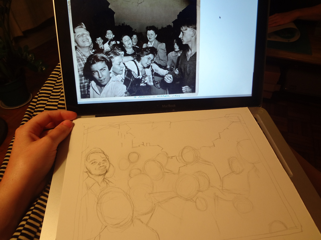
A few weeks ago, my teenhood dream came true when I was asked by someone at Maximumrocknroll-- world's most famous, long-running punk fanzine-- to contribute a drawing for their monthly "art page." I was more than likely asked to do this as a result of the work I've done on all the School Jerks albums, most recently their brand new debut LP.
I waited until the 11th hour to start the drawing-- I was asked by MRR to contribute during what was possibly one of the busiest few weeks I've had in a long time with work, school prep, and other projects. After breaking my brain trying to decide what to draw-- my brainstorm list included such grasps-at-straws as "cranes," "murder victims," "School Jerks outtakes," "Baltimore," "Google street view," "Kensington Market" and "mob scene"-- I finally settled on drawing American crime scene photographer Weegee's infamous snapshot, Their First Murder.
I first learned about Their First Murder a few years ago. For those who don't already know the back story, for this photo Weegee for once chose to turn his camera not on a crime scene, but at a crowd who had gathered to look at one. The photo depicts a range of emotions-- while a female relative of the victim cries, neighbourhood children rubberneck to catch their first glimpse of a dead man. Shot during the latter half of the dirty thirties, the viewer imagines the gunshot victim as two-bit hood or mafioso-type. Against the night sky, tenement housing looms heavily in the background.
To make the drawing sometime other than just a drawing of a photograph, I knew that the addition of a fitting caption of some sort would be key. Initially, I wanted to have the caption relate to the children's reactions, tying them to the fact that punk-- to me, anyway-- has always been about confronting and embracing darker aspects of life as opposed to denying or turning away from them, as well as defying social conventions. All of our lives, we are told to behave appropriately, and to not stare. The children's reaction to the dead body in the photo is curious and essentially pure.
When I decided that all the captions I came up would sound a little too misanthropic for the good of the drawing, I decided to seek out a fitting quote instead. The one I settled on is actually a portion of a poem written by a child in 1944 in the Terezin concentration camp, in what is now the Czech Republic under the tutelage of the artist-educator and possible pioneer of art therapy Friel Dicker-Brandeis. I am glad this reference is obscure enough to prevent a heavy holocaust reading of the drawing, because that's was definitely not a part of my original intention-- the drawing is still of a bunch of kids in New York City shot by Weegee, after all. The text is appropriate in that at its core is an allusion to creativity and resilience-- how creative acts are almost always concious or unconcious attempts at building an ideal world, against all odds.
Labels:
drawing,
illustration,
photography,
printed matter,
punk,
zines
Sunday, August 19, 2012
The Lesen Lounge on T Magazine/New York Times Blog
So much to catch up on here, but I'll start with this awesome tidbit. Talented friend and Toronto expat Leah Buckareff has started a new project in Berlin called the The Lesen Lounge-- a roving zine library cart attached to the back of her bike which she rides around to parks, letting people browse her collection of zines for reading enjoyment and inspiration purposes. In Leah's (adorable) words:
I really just want to share the zines with Berliners. (...) People think I’m trying to sell stuff...it’s about teaching people to make stuff rather than buying stuff – but they should buy zines. Not here, though. They’re just to read.
To learn more about The Lesen Lounge and Leah's impressive selection of zines from around the world, take a look at the project website. Also, don't forget to take a look at this article written for the New York Times online by another Toronto expat Nadja Sayej about the project, where you can find a photo and caption for my recent zine, Goin' Down the Road: Newfoundland Stories of Leaving.
Labels:
books,
libraries,
paper,
printed matter,
zines
Saturday, August 11, 2012
Monday, July 30, 2012
Zine Dream 5
Zine Dream-- the annual zine (among other things) fair-- is happening again in August, but this year it has grown into an impressive three-day event. Opening night is at the new location of Art Metropole; day two will feature a panel discussion moderated by small press/art/craft queen Shannon Gerard; and the main event takes place on day three-- a zine fair with 50+ vendors, entertainment and more.
I missed ZD last year on account of skipping town for Baltimore, but this year I'll be there with lotsa goodies. I'll have a few old zines up for grabs as well as these posters and a brand new collaborative zine that I'm hoping will be done by the 12th! Hope to see y'all there.
Event deets can be found here.
Thursday, July 19, 2012
This We Know... at Harbourfront Centre
This We Know...
An exhibition of recent work by students in the Aboriginal Visual Culture Program at OCAD University
Part of the Planet IndigenUS Festival
At Harbourfront Centre
August 10 – 19, 2012
Works by students in the Aboriginal Visual Culture Program at OCAD (Ontario College of Art and Design) University will highlight the diversity and beauty of the artworks they’ve produced this year. Our students’ work is accomplished, critical, experimental and personal, issuing from a place of enquiry and commitment.
The artists in the exhibit are Tara Bursey, Alexa Hatanaka, Cody Kullman, Morena Lopez, Melissa Penney, Janet Romero, Cheyenne Twiner, Georgina Walker, and Isaac Weber, and Glenna Matoush with Robert Houle and the students of Rethinking Abstraction from an Aboriginal Perspective.
The goal of the Aboriginal Visual Culture Program (ABVC), established in 2008, is to foster and disseminate Indigenous culture through art and design to Aboriginal and non-Aboriginal students. The courses emphasize collaboration, innovation and the integration of traditional practices and emerging technologies. ABVC students benefit from an interdisciplinary university environment that blends academic rigour with the experimental freedom of the studio.
The ABVC totem is nigig the otter. The otter represents the spirit of OCAD students with his playfulness, dexterity, inventiveness and curiosity, and inspires the OCAD faculty with his boundless energy and joy. Like an artist the otter dives deep into the depths of the unknown and emerges with a tool upon which to crack open the shell of his imagination. These are the characteristics the Aboriginal Visual Culture Program seeks to emulate.
Please join us for an Artists' talk on Saturday August 11, 2:00PM – 3:00PM, in the Marilyn Brewer Community Space, Harbourfront Centre, 235 Queens Quay West, Toronto
Sunday, July 08, 2012
Wednesday, July 04, 2012
The Encampment
I was lucky to catch The Encampment-- a massive temporary public art piece by artist collaborators (as well as a huge number of contributing artists) Thomas+Guinevere a couple of weeks ago at Fort York. 200 tents were placed on the grounds of Fort York-- site of The War of 1812-- which served as individual sites for artistic interventions. The project's handout explained that each tent installation was inspired by real individuals living in the Canadas during the war. As compelling as some of the tent installations were, for me the real power in the installation was the sight of the 200 tents together on a historic site against the backdrop of the changing city.
Though the tents were (for me) a thoroughly engaging evocation of Canada's history, I can't help but also see them a bittersweet metaphor for my own vague alienation and feelings of displacement in the city I was born in as it changes more everyday.
Labels:
architecture,
events,
installation,
psychogeography,
public art
Wednesday, June 27, 2012
Burning Schoolhouses
Just in time for Canada Day...fireworks! I'm happy to announce that I'll have some work up in an exhibition that will be a part of the Planet IndigenUS Festival in August. The festival will take part mainly at Harbourfront Centre, but also at partner institution Woodland Cultural Centre in Brantford, Ontario. The exhibition is a showcase of the work of students of the Aboriginal Visual Culture program at OCADU. I am not in the Aboriginal Visual Culture program myself, but I'm grateful to have been invited by department head and incredible artist Bonnie Devine to take part anyway. My piece is called Burning Schoolhouses-- more on them below.
Burning Schoolhouses, 2012
Fireworks, Japanese Kozo paper and adhesive
Installation dimensions variable
Each unit approximately 15cm X 14cm X 6cm
Burning Schoolhouses is a series of sculptural multiples inspired by the essay Confessions of a Born Again Pagan by Fred Kelly. The multiples employ the use of the classic firework, The Burning Schoolhouse, to explore the explosive issue of residential schools just over fifteen years after the last residential school in Canada was closed in 1996. The objects simultaneously connote a sense of celebration, violence and catharsis while embodying the complex and painful process of reconciliation for both aboriginal and non-aboriginal Canadians.
Thursday, June 14, 2012
Toronto Life
Two-colour Risograph prints on archival cardstock made in collaboration with JP King of Paper Pusher Print Works. These drawings will be on the upcoming School Jerks 12", due out in a matter of weeks.
1) Thanks, JP!
2) Prints can be purchased here.
Labels:
drawing,
illustration,
paper,
print,
printed matter,
punk,
rock'n'roll
Tuesday, June 05, 2012
Thursday
Lots happening this Thursday! First off, as I mentioned in a previous post, I'll be taking part in the exhibition Under 30 at 30 at the Japanese Paper Place's warehouse space on Brock Avenue. All day Thursday, the JPP will be celebrating their 30th Anniversary with an open house, exhibition, paper sale and heaps more. The exhibition opens in the evening...come out and support this singular Toronto institution in the process.
Japanese Paper Place - 30th Anniversary Celebration
Thursday, June 7, 2:30-9:30pm
77 Brock Avenue, Toronto
http://www.japanesepaperplace.com
Later that night, there will be a legal fee benefit event for my good friend, fibre artist Lizz Aston at The Piston, on Bloor Street West. Lizz was falsely accused of assault when someone ID'ed her to the police using Facebook, resulting in her unlawful arrest...! Unbelievable! I am donating the piece pictured above, A Breast, for the event's art auction. The night should be a blast, with dancing, crafty art and live music by psych/pop locals The Whirly Birds, The Persian Rugs and Hollow Earth, who I've been meaning to check out for ages.
For more info on the event, look here.
Labels:
events,
exhibitions,
food,
fun,
paper,
rock'n'roll
Tuesday, May 15, 2012
Under 30 at 30 at The Japanese Paper Place
My recent piece, A History of Hunger, will be shown at the Japanese Paper Place's upcoming exhibition Under 30 At 30, which will open during the first week of June. The exhibition is a small part of the JPP's 30th anniversary festivities, which will include a paper sale, workshops, an open house and more. They are such a unique local institution and I rely on them for project supplies frequently--I'm so glad they exist!
For more info on the JPP's 30th anniversary, look here.
Wednesday, May 09, 2012
School Jerks 12" Art
I've been busting my hump for the last week on drawings for the School Jerks 12", which is due out very, very soon. I'm down to the last two drawings and am really losing steam...! I'll be producing a 11"X17" 3-colour poster of all 17 or 18 drawings for the record in collaboration with Paper Pusher Print Works within the next few weeks. Very exciting stuff!
Tuesday, May 01, 2012
Rochester Trip
Took a quick trip across the pond to Rochester, New York last week. The weather was sort of craptastic (mostly cold and damp), but it was a really cool trip nonetheless. Rochester is a tiny city, with lots of neat art deco/art moderne architecture. The Kodak Building, the firehall on Chestnut Avenue and this old Chevrolet dealership (?) turned coffee shop in downtown Rochester's east end were highlights, for sure.
While I was there, I managed to take in a lot of art in both expected and unexpected places. I went to the George Eastman House (Eastman was founder of Kodak, which is based in Rochester) which is a museum of photography and film situated in an old ivy-covered mansion. There was an exhibition up which featured a number of photographic medallions from the early 20th Century such as the one above (scooped from the George Eastman House Flickr page). There was another small exhibition called Ballyhoo, which focused on promotional materials and signage from the golden age of film and was particularly neat. The one thing that irked me about Eastman House was it's lack of wayfinding information-- after leaving, we realized that we had missed two of the museum's exhibitions entirely. Rats!
One of our other stops was the Rochester Contemporary Art Center, which had a great show up called Work It: Artists Address Labour and Unemployment. It was nice to see pieces from Kathryn Clark's Foreclosure Quilt series up in this show, which I had only previously seen through images online. Also got to meet the gallery's plucky Director, who introduced himself and chatted for a while. Nice dude! Don't think that's ever happened to me in Toronto...!
Our first night there, we ventured into the amazing abandoned Rochester Subway tunnel with the friend we were staying with armed with only a single flashlight and about $10 (goes a long way in the U.S.) worth of alcohol . Apparently people go down into the tunnel all the time to explore-- there was a ton of graffiti down there. The above patch was particularly unusual.
This trip to Rochester made me miss Baltimore quite a bit, and reminded me how much smaller American cities have to offer. Canadians generally want to go to places like New York City and San Francisco on vacation-- understandably so, but smaller American cities seem to really have their own unique identity and a slew of neat things to check out that can be found pretty easily. I'm looking forward to going on more quick and dirty trips like this just south of the border in the future-- next up is Detroit, hopefully.
Labels:
architecture,
craft,
fibre art,
galleries,
labour,
museums,
photography,
public art
Subscribe to:
Posts (Atom)