Showing posts with label drawing. Show all posts

Saturday, January 10, 2015

The Evolution of a Drawing


I just finished the above drawing for Maximumrocknroll's upcoming Comics and Art Issue. This one is a real doozy...my hand still hurts!

The inclusion of the photos in this post illustrates how the drawn image came to be. In the summer, I took about a dozen photos after an industrial fire in the North End of Hamilton where I live. The photos turned out really well-- the contrast between the vivid blue sky, the iconic red Hamilton brick and the extremely orange rust was really striking. And the way the remains of the fire were reduced to rubble was also really something.

As amazing as the colour was in the photo, I decided to translate the photo into a black and white drawing. The idea for the drawing comes from global cities and global culture and the continuous allure of the cities named in the illustration (the text is lifted from the American Apparel bag) in contrast to my own feelings of immobility, and the obvious immobility of a lot of people who live in my city, and more specifically, my neighbourhood.

When I moved to Hamilton, I was more or less unemployed for over a year. In one of the coldest winters on record, Ben and I would walk for a half hour to his shop one block north of the site of this fire late at night to plan the business he was about to start. Even though we were on the cusp of "starting something new," it was one of the most depressing, lonely, fraught winters of both of our lives. Occasionally, I would go back to Toronto to visit friends and a favourite topic of conversation among many of my friends and acquaintances was the trips they were about to go on, had been on, or just went on as part of school or for pleasure. The contrast between the topic of travel and the way I felt at the time felt really cruel. 

This is what this drawing is about.

Wednesday, January 15, 2014

(becoming) The Logic of Memory at Hamilton Artist's Inc.

Image: Corinne Duchesne, Sybil, 2013. Mixed media drawing on mylar.

I'm unbelievably excited about the following exhibition which opens at The Inc. next week, featuring the work of Corinne Duchesne, Peter Horvath and one of my textile art heros of all time, Anna Torma.  It was an honour and a privilege to be asked to write the catalogue essay for this show.  Don't miss this one, folks!

*****

[becoming] The Logic of Memory
Corinne Duchesne, Peter Horvath, Anna Torma

January 23 – March 1, 2014

Opening reception: Thursday, January 23, 7:00 – 9:30pm

Art Crawl: Friday, February 14, 7:00 – 11:00pm

To paraphrase Deleuze, we can only function in the present, but we are always in motion, always becoming. Our past makes up who we are, but by contemplating these moments of the past, we are no longer remembering, we are constructing something new, in turn effecting our future understanding of the present.

Each of the artists in this exhibition explore the concept of memory. Their diverse perspectives weave together and encourage visitors to consider notions of memory, nostalgia, time and loss. Corinne Duchesne’s layered mixed media drawings on mylar philosophically consider loss as a locative site of memory, using grief as an anchor to merge anthropomorphic forms with objects. Peter Horvath’s 2-channel video installation, Memoir, compares and juxtaposes the biographical similarities between his mother Eva and friend Denise, who both emigrated to Canada from Hungary, albeit decades apart. The installation is structured to reflect upon the nature of memory, manipulating the space between truth and fiction, past and present. Anna Torma’s technically rich textile installations reflect on the nostalgia of home, her immigrant heritage, the natural environment and maps the human body recalling the synapses of the brain.

Combined, through the use of these personal assemblages, the works in this exhibition reflect on the location and constructed nature of memory and it’s ability to influence and shape our understanding of ourselves in the present.

A catalogue essay by Tara Bursey will accompany the exhibition.

Hamilton Artists Inc.
155 James Street North, Hamilton
http://theinc.ca/

Wednesday, October 02, 2013

More Punk Art


Setting in to my new digs in Hamilton has been a trip!  Work contracts, back-n-forth travel to TO, (unsuccessful) job hunting and moving has more or less put a halt to art-making endeavors except for some punk rock-related bits and pieces.  This kinda makes sense considering the very last things I did before leaving TO were putting on the Fear of Punk show and popping of a quick LP cover for a friend's band.

A few weeks ago, I was asked for an interview for an incredible NYC-based comics anthology called Happiness, published and edited by the talented Leah Wishnia.  The interview will also include contributions from two of the four School Jerks-- I've done the art for all of their recorded output, and the interview is mostly about the work I've done for them.  Doing this interview gave me a rare opportunity to talk about my other "art-half" (the one that does art for punk bands) and reflect on how I started doing this this type of work.   I've included some of the interview text here (it's only a small portion of the entire interview):

Doing show flyers and album artwork grew out of my work making zines.  I remember being 17 or 18 thinking that it would be a really great job to be a freelance illustrator, doing art for bands both in and outside of punk that was not unlike the work I did for the zines I had been making for years.  This was before I realized how hard it was to get paid by bands that see you as a friend or acquaintance doing the band a favour!  When I was 18, I dropped out of art school and had a string of crappy jobs.  Doing flyers for neighbourhood bands and the odd flyer for performers and punk bands was less a way of making money than a way I kept an art practice going and got to know people while I just floated around aimlessly working retail, socializing, and trying to make an adult life for myself.

My first real job doing an album cover that was widely distributed was for the LP of a Toronto band called Action in 2003 or so.  They were pretty young and got signed to the label Punkcore from New York and were really excited about the prospect of touring and being on the same label as some of their favourite bands growing up.  The drummer Greg was my best friend at the time.  I was really happy to be a part of it because they were all friends of mine, we were all from the same suburb of Toronto, and it was such a big deal for all of us to feel like we were “making it” on some level-- they were under 20, and I was a couple years older.  I ended up doing their pin designs, t-shirt designs and the front cover, back cover and insert art for their LP.  This was my first taste of having a hand in shaping the entire visual identity of a band and at the time it was really rewarding and exciting for all of us to be doing something we knew a ton of people would see and hear. 

To be honest, ten years later, punk rock isn’t as much a part of my daily life as it used to be when I was 20, or even 25.  I have a pretty broad art practice that involves making art for punk bands but also sculpture/installation, publications and curating among other things.  I listen to way more 60s psych and hard rock than punk these days.  I am lucky to have developed my drawing skills at a really young age (I went to an arts high school where most students wanted to be animators for Disney!), so now I have this skill that I can basically pull out of my back pocket when I need to.  Most of the time it’s to draw a dripping skull or something grim for some punk dude, which is fine when I have the time.

(...)

I think Ben said it best in another interview when he said that while art has always taken a backseat in punk, it plays a huge part in how punk is understood by itself and the world.  Also, within punk, art (lyrics too) can be an introduction or passage to social and political issues that would be more difficult to understand through a textbook or a news source, especially for young people.  For example, when I was a teenager, the art of Gee Vaucher and Winston Smith (for Crass and the Dead Kennedys respectively) was a way for me to begin to explore radical politics. Punk art can be frightening, stimulating, exciting, thought provoking and (gasp) even beautiful.  Over the years, I’ve learned a lot from it, too.


Collage by Gee Vaucher

The Fear of Punk//Fear of Art show has been a great way to expand on the work for bands and connect with people who are serious about doing art work in and around punk rock.  Along these lines, I was also asked recently to do contribute a page to a screenprinted zine of fake comic book covers by punk artists, organized by another awesome artist, Yecatl Pena in Mexico.  My recent fixation on post-apocalyptic films produced this silly but fun comic cover based on the cover old comic book of mine, inspired by the record cover I did for Absolut at the end of the summer-- in progress!


Wednesday, September 04, 2013

Fear of Punk//Fear of Art


It has been a very long time since I posted anything here...!

So much to catch up on over the next little while, but I'll start with this-- Fear of Punk//Fear of Art came and went this summer, and it was both a blast and a huge success.  Thanks to all of the amazing exhibitors, to my partner in crime Benbis, James Binnie and Communication Art Gallery, Jesjit and Zine Dream, the bands that played our benefit show at the 460 (Hassler, Absolut and Spearhead) and all our friends for the support!

For more photos of the installation and opening night, take a look here.  And look here for a great feature on the exhibition that was posted on Broken Pencil's blog a week before the show opened.  We'll be following this exhibition up with a catalogue that will also serve as the first issue of an ongoing zine, so stay tuned for more info on that in the coming weeks...

Sunday, December 30, 2012

Art Page in MRR #356


My drawing for the Maximumrocknroll art page is now out in the January 2013 issue, #356.  Check it out!  More writing about it can be found here.  Big thanks to Bidi Choudhury for inviting me to do it!

Friday, November 23, 2012

School Jerks LP on Art 4 Punks


Big huge thanks to the very cool Paul D'Elia for posting about the School Jerks LP art on his blog, Art 4 Punks. Having a blog focus on the art and design of contemporary punk and hardcore is a noble pursuit that I cannot endorse enough.  Nice to feel appreciated, to say the least!  Also, thanks to anyone who has spoken up online and in person (locally, all two of you...ha, ha...) about how much they dig the art for this record and the previous EPs.

Also, I recently made the jump from Wordpress to Tumblr as a platform for an archive of the punk/rock/music related art I've done.  Check it out here, and dig deep for some seriously moldy oldies that will prove that I'm not as young and fresh as I look.

Thursday, August 30, 2012

This Week


Began one mammoth project...


...and finished another.  Perhaps rock'n'roll cross-stitch is my calling...?

Tuesday, August 21, 2012

Barbed Wire Blooms


A few weeks ago, my teenhood dream came true when I was asked by someone at Maximumrocknroll-- world's most famous, long-running punk fanzine-- to contribute a drawing for their monthly "art page."  I was more than likely asked to do this as a result of the work I've done on all the School Jerks albums, most recently their brand new debut LP.


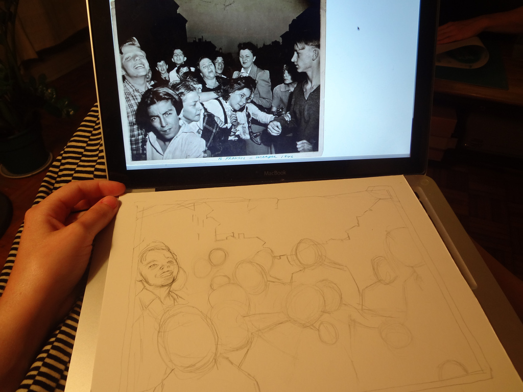
I waited until the 11th hour to start the drawing-- I was asked by MRR to contribute during what was possibly one of the busiest few weeks I've had in a long time with work, school prep, and other projects.  After breaking my brain trying to decide what to draw-- my brainstorm list included such grasps-at-straws as "cranes," "murder victims," "School Jerks outtakes," "Baltimore," "Google street view," "Kensington Market" and "mob scene"-- I finally settled on drawing American crime scene photographer Weegee's infamous snapshot, Their First Murder.


I first learned about Their First Murder a few years ago.  For those who don't already know the back story, for this photo Weegee for once chose to turn his camera not on a crime scene, but at a crowd who had gathered to look at one.  The photo depicts a range of emotions-- while a female relative of the victim cries, neighbourhood children rubberneck to catch their first glimpse of a dead man.  Shot during the latter half of the dirty thirties, the viewer imagines the gunshot victim as two-bit hood or mafioso-type.  Against the night sky, tenement housing looms heavily in the background.

To make the drawing sometime other than just a drawing of a photograph, I knew that the addition of a fitting caption of some sort would be key.  Initially, I wanted to have the caption relate to the children's reactions, tying them to the fact that punk-- to me, anyway-- has always been about confronting and embracing darker aspects of life as opposed to denying or turning away from them, as well as defying social conventions.  All of our lives, we are told to behave appropriately, and to not stare.  The children's reaction to the dead body in the photo is curious and essentially pure.

When I decided that all the captions I came up would sound a little too misanthropic for the good of the drawing, I decided to seek out a fitting quote instead.  The one I settled on is actually a portion of a poem written by a child in 1944 in the Terezin concentration camp, in what is now the Czech Republic under the tutelage of the artist-educator and possible pioneer of art therapy Friel Dicker-Brandeis.  I am glad this reference is obscure enough to prevent a heavy holocaust reading of the drawing, because that's was definitely not a part of my original intention-- the drawing is still of a bunch of kids in New York City shot by Weegee, after all.  The text is appropriate in that at its core is an allusion to creativity and resilience-- how creative acts are almost always concious or unconcious attempts at building an ideal world, against all odds.

Thursday, June 14, 2012

Toronto Life


Two-colour Risograph prints on archival cardstock made in collaboration with JP King of Paper Pusher Print Works. These drawings will be on the upcoming School Jerks 12", due out in a matter of weeks.

1) Thanks, JP!  
2) Prints can be purchased here.

Wednesday, May 09, 2012

School Jerks 12" Art


I've been busting my hump for the last week on drawings for the School Jerks 12", which is due out very, very soon. I'm down to the last two drawings and am really losing steam...!  I'll be producing a 11"X17" 3-colour poster of all 17 or 18 drawings for the record in collaboration with Paper Pusher Print Works within the next few weeks.  Very exciting stuff!

Monday, April 16, 2012

Parallax Scroll at Harbourfront Centre


Went to Harbourfront's York Quay Centre on Saturday to check out this season's exhibitions before they closed on Sunday night.  While I went expecting to get a bang out of the craft department's biennial, LOOK Out (and don't get me wrong, I did...), I was completely blown away by Scott Carruthers' drawing installation, Parallax Scroll.  An immersive barrage of image and text reminiscent of  R. Crumb or Lee's Palace muralist Al Runt, Carruthers' intense drawings reminded me of amazing punk album art.  It also made me think of the internet...except more honest.

Favourite exhibition visited in a very long time.  Thanks, Scott!

Tuesday, January 10, 2012

Museozine

Museozine

I completed my latest zine exactly a week ago, making my collective zine output total a whopping four zines-- two were collaborations, and two were my own-- in 2011, the official year of the Revenge of Print.  Looking back, I feel that I did well...I did my part for the revenge!  Print was one of my first loves. Needless to say, I hope it is here to stay.

While this zine came to fruition mere days into 2012, I consider it a '2011' zine because so much of its research and construction was done in 2011.  In a nutshell, Museozine is a zine of interviews with friends of mine-- all wonderfully creative young people who craft, make music and make art on their own terms-- about their museum experiences.  These interviews started off as casual research I was doing for my job at a small Toronto museum last summer.  The interviews were, in some cases, so honest and joyful and surprising that I felt like I just had to publish them in zine form as a way of honoring and preserving them.

Some of my favourite moments in the zine include the following quotes:

"When I was a young kid I loved to sit upside down on the couch (legs up the wall, head hanging down over the end of the seat) and look at the living room/kitchen upside down and fantasize about how cool it would be to be able to walk around in a house that was upside down.  Really upside down, but defying gravity so everything would stay in its place, and to walk in the front door and try to navigate around the house that way and see all the familiar objects in this whole new way.  I did this a lot.  It was a bit of an obsession.  There's my dream museum-- my childhood home upside down."  --Elaine B.

"If I could create my own museum it would be quite a bit like my own apartment, except much, much bigger...everything from old print (magazines, comic books, fanzines, old books) to old toys, various pop culture items, guitars and music gear, and-- probably most importantly-- vinyl records."  --Matt H.

"I think a hobo museum would be cool.  It would have a riding the rails simulator, and a hobo camp staffed with historical re-enactors like Black Creek Pioneer Village, and maybe a folk singer from the 20s or 30s.  Although this is changing, museums tend not to represent the lives of people on the margins of history."  --Patrick M.

Today, headlines about millions of dollars in funding for culture and research being cut from both the municipal and the provincial budget over the next year were splashed across Toronto papers.  Sad when you consider how much museums have captured the imaginations of the people I interviewed.  Most of these interviews referred to childhood museum experiences, which, for the case of many, happened in the 1980s, before the massive culture funding slashes and economic recession of the very late 1980s and early 1990s.  There is currently an accessibility problem among Toronto's museums.  I hate to think that the current economic climate and recent cuts will make the current problem (or crisis, even) of local museum accessibility--and not to mention cultural funding-- even worse.

For lots of impassioned writing on the topic of public access to museums and cultural institutions, check out Toronto critic and arts writer Leah Sandals' always engaging blog, Unedit My Heart.

Monday, January 02, 2012

16 Museums

24 Hours Later

For a zine that I'm working on which should be done later on today, hopefully!  More on this later...

Thursday, November 03, 2011

Don't Flinch, Jack.

Don't Flinch, Jack. Don't Flinch, Jack.
Photos from an assignment from school that incorporates performance and hand-drawn posters of quotes about labour taken from Newfoundland "Jack Stories," Barbara Erhenreich's book, Nickled and Dimed, and an interview with my father. This performance isn't quite where I want it to be, so I won't post too much about it here. The photos turned out good, though!

Top Photo: Kristine Woods

Thursday, April 28, 2011

Three Towers

Radio Tower
Hometown
Loveless Town
These are three pin designs I drew two days ago for my pals, the Modern Superstitions. Text will be added which will also be hand-drawn, and it looks like we'll only be using the bottom two after all-- the water tower and the hydro tower.

Modern Superstitions are the easiest band to do artwork for-- it is always a huge pleasure. The main reason for this is that both their lyrics and music are so damn evocative. The idea of bell towers and clock towers immediately came to mind when I first listened to the songs on their last EP. We ended up going with a stained glass motif as a slight variation on those ideas, but I was able to work with towers in this pin project, which I'm grateful for. These towers are definitely less majestic and more mundane and "local" feeling, which matches some of their songs and lyrics this time around-- Hometown, Loveless Town, etc.

The hydro tower is an ode to my own hometown, Scarborough (incidentally, also a loveless town!). The water tower is an icon associated with more rural hometowns. The idea is that the hydro tower pin be silver, and the water tower be a bronzy gold...we'll see if everything works out as planned!

Friday, March 25, 2011

Psychedelic Album Art


I once joked that I can tell how awesome an album is going to be based on how illegible the album's title is on it's cover. If this sounds weird, it's because most of the albums I consume are from the psychedelic era. Here are some examples of records from my collection with totally over-the-top cover art and creative (if completely unreadable) examples of typography. This post is probably inspired by my recent review of the work of Marian Bantjes, who has admitted to being influenced by the art and design of the late 60s.

From the top:
The Incredible String Band, The Five Hundred Spirits or The Layers of the Purple Onion (Elektra, 1967)
SRC, Self-titled (Capitol, 1968)
Elyse, Self-titled (Tetragrammaton, 1968)
Pisces, A Lovely Sight (Reissue on Numero Group, 2009)
The Tiffany Shade, Self-titled (Mainstream, 1968)

Saturday, March 19, 2011

School Jerks 3rd 7"


This glorious recorded artifact of the hardcore punk persuasion came out about a month ago, and the cover drawing is by yours truly. I hand-stamped the logo on about 200 of the 1000 copies that were made, too.

School Jerks' myspace can be found here.

Wednesday, March 09, 2011

Joni Mitchell Draws on the CBC, 1967


Joni talks negative and positive space with the hosts, and does a pretty groovy drawing. This is one of many very fun CBC RetroBites, scooped off of the CBC's Youtube channel.

Thursday, February 03, 2011

Skele-toons


I've been finding myself particularly drawn to skeleton imagery lately. These are three pieces of work I've found in my travels lately, online and in person. The first is a skeleton drawing by local artist Shannon Gerard, that I acquired at her awesome studio sale that took place last weekend. The drawing is from the comic she did called Sword of My Mouth, which came out last year on Jim Munroe's No Media Kings book label. I'm looking ever-so-forward to framing it and putting it up somewhere. Finally...a piece of work that my boyfriend and I can agree on. Skeletons are unisex, right? We all have them!

The next two pieces are ones I found on Etsy by Portland artist Michael Paulus. These famous cartoon character skeleton drawings-- and the way he goes about doing them-- are pretty priceless. His project statement about them is pretty interesting too...the following text is scooped from his website under the series Character Study:

Animation was the format of choice for children's television in the 1960s, a decade in which children's programming became almost entirely animated. Growing up in that period, I tended to take for granted the distortions and strange bodies of these entities.These Icons are usually grotesquely distorted from the human form from which they derive.

I decided to take a select few of these popular characters and render their skeletal systems as I imagine they might resemble if one truly had eye sockets half the size of its head, or fingerless-hands, or feet comprising 60% of its body mass.

These characters have become conventions that are set, defined, and well-known personas in our culture. Being that they are so commonplace and accepted as existing I thought I would dissect them like science does to all living objects - trying to come to an understanding as to their origins and true physiological make up. Possibly to better understand them and see them in a new light for what they are in the most basic of terms.

Sunday, January 09, 2011

Hand and Rosary

Process shots of my work for the next School Jerks 7". Just finished it this morning!