Wednesday, October 19, 2011

The Wall at the Back of the Theater

The Brick Wall at the Back of the Theatre

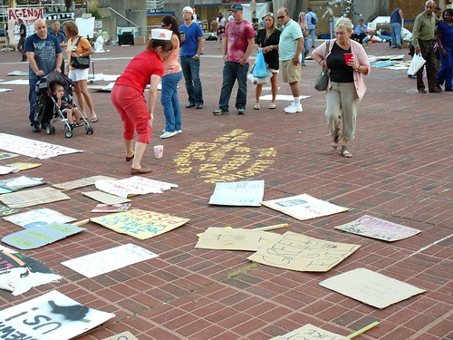
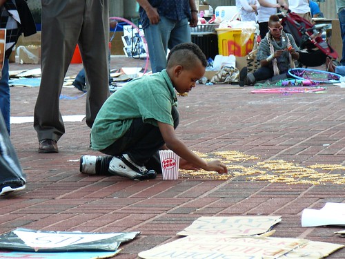
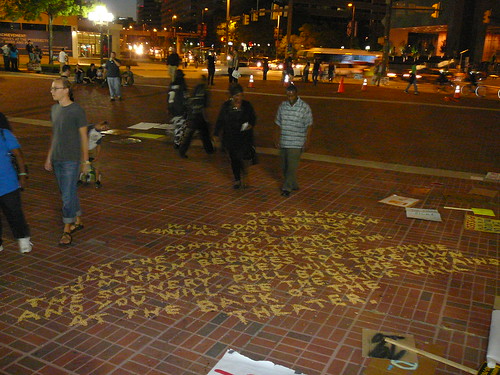
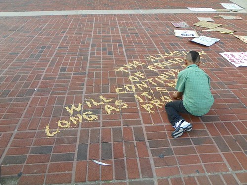
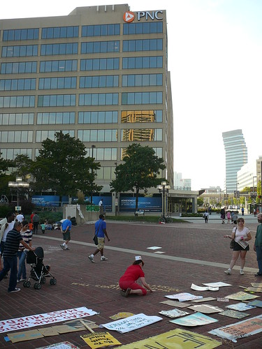
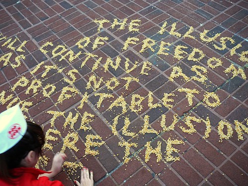
A couple of Sundays ago, I decided to do a performance for Occupy Baltimore-- Baltimore's version of the Wall Street Protests-- which started a few weeks ago in a public square in the Inner Harbour area of town. The performance was inspired by a project I was assigned in a performance class (I still have yet to do the actual assignment in class on Monday...this wasn't the school assignment) where we were asked to develop a character or alter ego.  For this piece in McKeldin Square, I became an out-of-work "popcorn lady" who lost her job because the theatre she worked at (In the present? In the 40s or 50s?  I'm not quite sure...) closed down.  The performance consisted of me kneeling on the ground for two hours, spelling out a long quote in popcorn kernels.  The quote belongs to the annoying, but highly quotable (Baltimore-born) Frank Zappa, who once said: "The Illusion of freedom will continue as long as it's profitable to continue the illusion.  At the point where the illusion becomes to expensive to maintain, they will take down the scenery...pull back the curtains...and you will see the brick wall at the back of the theatre."  The quote was slightly abridged from it's original form for the performance, for the sake of my knees and back.

The Brick Wall at the Back of the Theatre

This performance was obviously inspired by my time in Baltimore-- and the United States.  It is a crazy time to be here-- there have been protests across the country, and Baltimore itself has been a troubled city since the 1960s.  The downtown core of Baltimore is beautiful, but largely deserted.  There is poverty and blight everywhere.  While the arts community and a select few are fighting hard for the city to have a chance at a renaissance, it will be a long, hard road.  What are the odds that it will happen?  This is a city made for a million people, and the population has steadily declined since the 1970s to 620,000 people.  Poor Baltimore-- in so many ways, the city and its people have been really inspiring, but I leave for good in December.  I know it will haunt me, and I will wonder and worry about it as if it was a wayward friend.

The Brick Wall at the Back of the Theatre

On a lighter note, executing this piece was rough.  I did a somewhat similar performance with popcorn kernels last spring that took just under half as long, and that was hard enough.  Because the piece is at least partially about labour, the endurance aspect of the piece was fitting.  About a third of the way through the quote, this sweet little man offered me a bit of help.  He did one letter-- an F-- before I shoo-ed him away because he was slowing me down.  The poor guy was very disappointed, and reluctantly left me to my work after a while.  I really hit my stride after he left.

The Brick Wall at the Back of the Theatre

This was the first piece of "work" that has materialized since my arrival here, and I'm glad to have it more or less behind me. There is definitely more to come soon.  I'll end this post with the lyrics of a Randy Newman song I only just heard for the first time yesterday.  While my photos don't really illustrate the Baltimore this song speaks of, the idea of it is definitely simmering close the core of this piece.

Beat up little seagull
On a marble stair
Tryin' to find the ocean
Lookin' everywhere

Hard times in the city
In a hard town by the sea
Ain't nowhere to run to
There ain't nothin' here for free

Hooker on the corner
Waitin' for a train
Drunk lyin' on the sidewalk
Sleepin' in the rain

And they hide their faces
And they hide their eyes
'Cause the city's dyin'
And they don't know why

Oh Baltimore
Man it's hard just to live
Oh, Baltimore
Man, it's hard just to life, just to live

The Brick Wall at the Back of the Theatre

Monday, October 10, 2011

The Illusion of Freedom...

The Illusion of Freedom...

My little helper at work in McKeldin Square, at Occupy Baltimore yesterday afternoon.  Much more on this later.

Photo: Jacob Ryan Smith via Facebook

Friday, October 07, 2011

NFLD Stories of Leaving


Started a new blog yesterday afternoon for a school project, and it is likely that the project will become an ongoing one. The project will probably apply to very few reading this, but if you can think of anyone who would be interested, please feel free to pass on the blog address/call for submissions.

http://nfldstoriesofleaving.blogspot.com

FYI: Goin' Down the Road is a classic Canadian film about two Maritimers traveling to Toronto look for work in the early 70s. It provided much inspiration for this project.

Thursday, October 06, 2011

Das Bande

Das Bande

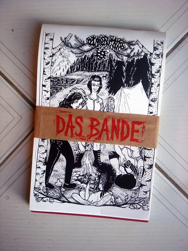
Among all of the work and relocation-related craziness I was faced with this summer, I somehow managed to begin one zine collaboration project, and end another. This one-- Das Bande-- was a whopping year-and-a-half in the works. I am happy to say that it finally made its way into the world in August...the week that I left town!

  Das Bande

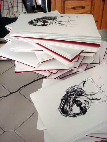
Das Bande was a collaboration between Gena Meldazy and myself. Gena was one of the people interviewed for my Punk Rockers on Creative Survival and the Survival of Creativity zine in 2009. Shortly after finishing that project, Gena asked if I would like to work with her on a zine project that focusses on women involved in punk rock across Canada. The zine ended up featuring several interviews (mostly conducted by Gena) with individuals (most impressively Jade Blade from the legendary Vancouver punk band The Dishrags...whoa!), and the interviews were broken up by drawings I did of girls from in and around Toronto's punk scene. For the cover, we asked the formerly of Toronto/now of Vancouver printmaker and illustrator Megan Speers to draw something, and the result-- a gang of girls camping in rural BC, presumably?-- was totally and utterly amazing. After much humming and hawing over an appropriate name for the zine, we finally settled on Das Bande, and I hand stamped title bands for the small print run of 50 zines in total. The zine also has a fold-out poster of the interior drawings I did for the zine, which I unfortunately lacked the foresight to photograph...darn!

Do you want a copy of this zine?  Gena is overseeing its distribution, and I suspect that they may be all accounted for seeing as the print run was so small.  If you're interested, contact Gena and ask her if and how you can get one.


Monday, September 26, 2011

Robyn Love Interview on TCA


Conducted an interview with knit-ty multi-disciplinary artist Robyn Love last week in honour of the massive public art project that she was commissioned to do for the Cheongju International Craft Biennale. The interview was posted on TCA last Friday...read it and get inspired! http://torontocraftalert.ca/2011/09/23/questions-for-crafters-cheongju-robyn-love/

Image: Water Tower Cozy by Robyn Love, courtesy of her website.

Tuesday, September 20, 2011

Cover Stories

Cover Stories Cover Stories


Before I left to come to Baltimore exactly one month ago, I packed my life with an unbelievable amount of projects-- mostly collaborative.  Some had been in the works for a while, and I felt a real responsibility to have things finally materialize before I left town.  It was also a good way to spend some time with the people I know before I left Toronto for a while.

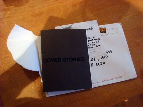
One such project was "curating" the exhibition Cover Stories for the Toronto Zine Library.  While I was asked by the TZL to curate an exhibition, it was largely a collaboration between myself and three of the members of the TZL Collective-- Lyndall, a talented lady who made a documentary about Who's Emma a few years ago; Chris, the creator of many zines over the last 10 or 15 years, at least one of which is considered a Canadian "classic"; and Patrick, who is one of the founding members of the TZL, and is a great all-round guy and an amazing baker.  After being asked to help create an exhibition, I spent three or four weeks going through the library's massive collection with a fine tooth comb, picking out any zines that I liked especially, or pulling out zines that shared some sort of mutual connection.  While I went into this project not having any curatorial theme in mind whatsoever, one slowly emerged. As an artist and zine-maker, I couldn't help be attracted to interesting and unique design in the zines I came across.  I eventually decided that creating a narrative about zines through their covers might be a neat way to create an exhibition that, while forming physical zine "groups," doesn't claim to draw on any real fixed history of zine-making.

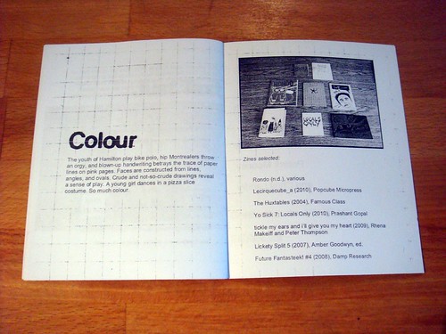
I eventually chose a pile of zines and divided them into 6 loose thematic groups which eventually became "Just Text," "Print Media," Colour," "Little Zines," "Hearts and Other Body Parts," and "In the Mail."  Each collective member of those mentioned above chose two groups at random to write short didactic descriptions about to serve as wall text for the exhibition, interpreting the themes as they saw fit.  I wrote the following summary of the exhibition:

Cover Stories is an exhibition of selections from the public collection of the Toronto Zine Library.  Using thematically-grouped zine covers as a springboard, we thought it would be interesting to highlight zine art and design as a way of telling the greater story of zines– what they are, how they’ve changed over the years, and why they continue to be a valuable and relevant medium.  While some selections from the library have been refashioned as photographs for this exhibition, others appear in their original form to be handled and appreciated as intimate and tactile objects.   In creating this interactive exhibition, we hope that you will spend time with some of the titles on display while learning about zines as both an art form and a method of communication.


We were REALLY down to the wire with finishing work for this exhibition-- we ended up installing the show two days before I left for Baltimore!  I am thrilled with how the exhibition turned out-- it was a really great collaboration, and everyone played a really important part in making it happen.  Lyndall took some really fantastic pictures of the zines that were chosen for the exhibition, and Chris played a huge part in designing and assembling what ended up being a really wonderful exhibition zine/catalogue (pictured above), which will serve as a great document for after the show comes down.

Cover Stories should still be up in the Southern Cross Room of the TRANZAC Club at 292 Brunswick Avenue, in the Annex.  I'm not sure when it's coming down, but if you're interested in checking it out, do so soon!

Monday, September 12, 2011

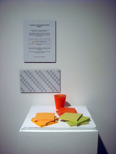
The Feedback Quilt Project

The Feedback Quilt Project
The Feedback Quilt Project The Feedback Quilt Project


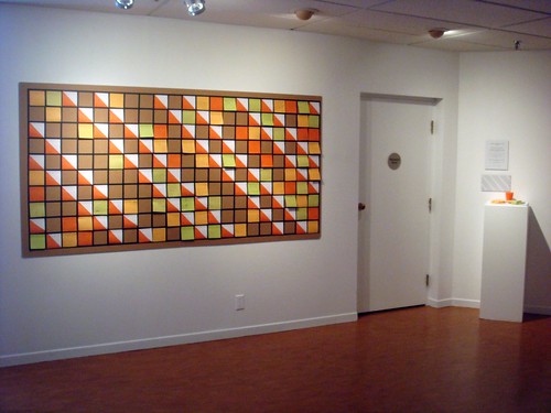
I'm going to step back in time a bit to post some documentation of a participatory activity I designed for the TMC that was up in the museum for the month of August. The quilt was part of a larger project I did for the museum, doing qualitative research about visitor engagement and satisfaction. Inspired by some of the ideas in Nina Simon's book, The Participatory Museum, I thought I would make an in-museum project that would serve as something of an interactive guestbook. Here is a short summary I wrote about the quilt that explains it a bit more. I'm happy to report that by the end of my contract on August 19th, the quilt was almost completely done!

The purpose of The Feedback Quilt Project is to create a participatory visitor feedback activity for the museum space. Its goals are to collect and preserve visitor content, to create a more interactive museum environment, to educate visitors about a particular material practice (quilt structure and construction) and to become a “town square,” essentially creating an alternative portrait of our visitorship.

A 3-colour hourglass quilt structure (http://quilting.about.com/od/blockofthemonth/ss/cal-hourglass-quilt-block_2.htm) was mapped out on an 8’ X 4’ piece of Foamcore with a 1/2", dark-coloured masking tape. The board was mounted to a wall facing the 2nd floor elevators and stairwell. The activity requires that visitors answer at least one of three questions:


1. Describe your ‘Fantasy Museum.” 
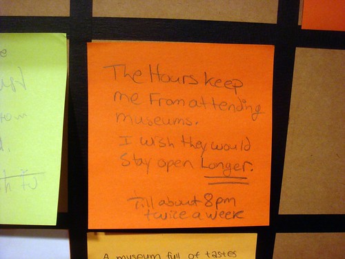
2. What keeps you from going to museums? 
3. What do you want out of a museum for textiles? 


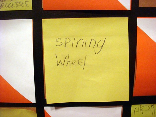
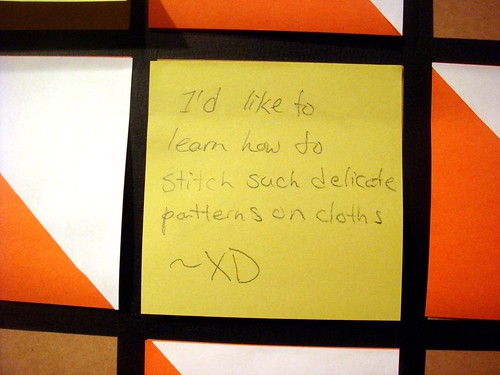
Each question has a corresponding coloured “quilt block” sticky note. Using a dry-mounted, colour-coded quilt legend, visitors placed a sticky note with their response in the appropriate position on the quilt template, almost like a large paint by numbers or cross-stitch kit. In doing so they are building a large quilt form together, and the more questions they respond to, the more the “quilt” starts to take shape. The quilt form was chosen as a basis for the activity due to the connections between quilting, community and communication.

Responses to this activity were revealing.  Many people took the opportunity to spill their guts about what they felt museums were and weren't giving them as visitors.  Many focused on the price and hours of operation of museums not being accessible.  A few came up with truly amazing ideas for fantasy museums-- a museum of smells, a snowglobe museum, a "museum of everything in the entire world." I came away from the project at the end of my contract realizing that museum visitors will reveal a lot to you if you make the effort to stray away from the same old prescribed questions, such as "are you a return visitor?" and "how did you hear about our museum?"

My sincerest thanks goes out to the museum for giving me the chance to basically make art and talk to enthusiastic museum-goers and textile fans all summer.  Funnest job ever!

For more documentation of the quilt, check out the TMC's fantastic Facebook Page.

Thursday, September 08, 2011

On Ownership

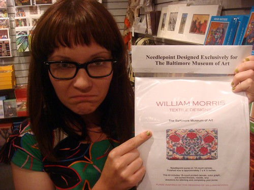
William Morris Cross Stitch?!?!

My Crossed Stitches project has officially come full circle-- someone else made a William Morris cross stitch kit, and is selling them for $82.00 at the BMA gift shop!!  "Needlepoint designed exclusively for The Baltimore Museum of Art."  Unbelievably annoying...but also totally hilarious and ironic.

Photo Credit: B. Needham

Thursday, September 01, 2011

Heir/Looms

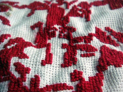
William Morris Needlepoint
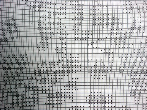
Cross Stitch Pattern

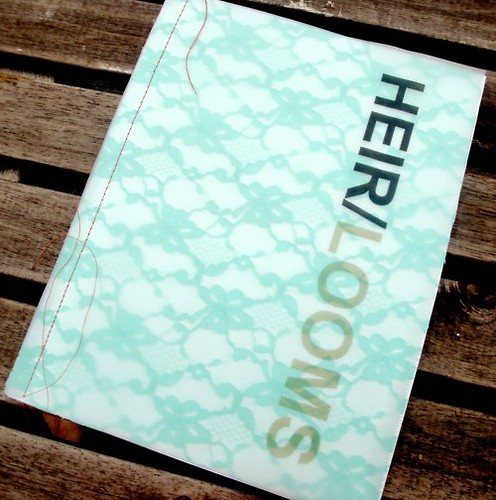
Last week, my project Crossed Stitches was included in the exhibition Heir/looms, curated by Nicole Dawkins for Studio Beluga in Montreal.  The exhibition seems to have gone off without a hitch...congratulations Nicole, and thanks so much for including me!

A really gorgeous and engrossing catalogue accompanied the exhibition, packed with artist interviews, images and multiple exhibition essays.  It was a real honour to be included in it.  The catalogue is a super limited edition, so I thought I'd include my complete catalogue interview and artists statement here for anyone who is interested in me nattering on and on about myself and my family...
Heir/Looms


How much can we really claim to “own” our ideas?  The repeating, reworking and re-contextualizing of ideas from the past is part of the postmodern condition.  So many ideas have come to fruition over the course of history-- when we make something, what are the odds that it hasn’t been made before?  Anyone who has come across the work of another artist that is uncannily similar to their own knows what it means to have their sense of ownership over an idea thwarted.    Perhaps the solution to this dilemma is to forfeit ownership altogether.

My piece, Crossed Stitches, explores these ideas.  Focussing on a wallpaper design by William Morris-- a designer whose level of influence cannot be overestimated-- I went through the painstaking process of creating an accurate and fully-functional cross-stitch pattern that corresponds to his original design.  This process involved transferring each design onto a large grid and translating each pattern so that it is comprised of squares on a grid.  These large-scale grid drawings were then used to make a cross-stitch pattern on another piece of grid paper, dividing the colours of the pattern into symbols as “real” cross-stitch patterns do.  This final pattern was then included in hand-made cross-stitch kits, so people can make their own William Morris “fabric swatches.”

Crossed Stitches has been paired with an embroidered piece by my mother, created for me in 1989 from a commercial cross-stitch pattern from a book called Patterns From the Past.  Both pieces represent different views on the issues of authorship and authenticity.


How did you come to work with fibre-based materials?
When I think back to the very first pieces of sculptural work I made as a student long ago, I remember using materials that weren't "artists" materials, probably because I wanted to make the work that I was envisioning without having the equipment, or the technical know-how attached to sculptural materials such as clay and plaster. I remember making sculptures out of crumpled up tin foil, ceramic tiles, coffee filters, paper-- materials that are very rooted in the domestic and "every day." Early on, I was inspired by artists like Robert Rauschenberg (still one of my very favourite artists), and I think this work was partially inspired by artists like him who worked with simple, cheap found materials poached from every day life. Then about 6 or 7 years ago I made a leap from attempting to make art that was like pure sculpture to making work involving garments. I would buy used garments and speculate who the owner used to be, and how the garment might be a reflection of who that person was and what they did with their lives. I would sometimes attach used garments to found old photos and create narratives with installations centred around the found garment. While this body of work didn't last long I consider it my first serious body of work, and it definitely set the stones for a long-standing interest in garments, textiles and fibre art which has been a part of my work to varying degrees for quite a while now.

How does the materiality and practices of working with your chosen medium affect the conceptual focus of your work? 
I work in many different media. Generally I will get an idea for work, and will work in whatever medium I have to to get the work done, whether it be a drawing with ink, needlepoint or a sculpture made out of miniature shrimp that is inspired by lace. Sometimes the concept informs the choice of material, and sometimes an experiment with an interesting material will lead to a concept that is linked to what the materials are "doing" or can do. Both material and concept are very important and inextricably linked in my work. The Crossed Stitches work is a good example of this.

How or where did you learn to stitch or sew? 
My grandmother taught me to crochet and my mother taught me needlepoint. I remember being about 8 or 9, spending a ton of time doing both. I didn't keep up with either craft, but picked them both up later in life as part of my art practice.

Is there a tradition of craft/making in your family? 
Definitely. Growing up, I had a great deal of contact with my mother's side of the family, who are Macedonian. The main form of craft that my family engaged in was crochet. My grandmother crocheted these sock-like slippers for my mother, her sisters and all of my cousins (and I) every winter for most of her/our life. She even crocheted me a bra for one of my dolls once...!!!! Recently, my mother must have been having a particularly sentimental day (!) because she showed me a huge bin full of crocheted baby clothed and blankets that my grandmother, other relatives, and her old co-workers made me when I was a baby. My mind was blown and I was very humbled by the incredible skill and patience used in the making of these objects. As my mother pulled miniature sweater after miniature sweater made by many different people, I was amazed to recognize my grandmother's work immediately. The crocheted items she made were simpler, less decorative and more utilitarian than the rest of the baby clothes. My mother showed me a baby blanket my grandmother crocheted that was incredibly beautiful in it's simplicity. My mother said something along the lines of "your grandmother made that when they didn't have any money at all. She would just work and work on that blanket." That is the thing that I appreciate the most about the items crocheted items I've come across made by my grandmother and other family and people around me growing up. Many of these people didn't have much money, but they always found something to give...they were so generous. Usually these things were hand-made-- clothing, food, and things like that.

Interestingly, the side of my family that I don't have a lot of contact with-- the family from Newfoundland-- are even bigger makers than my Macedonian family. The culture of making and crafting in Newfoundland is such a rich one. This is something I'm starting to learn a bit about, and would love to learn about more in the future.

How does this affect your relationship to these materials and practices? 
I don't know how much it directly affects the work that I've done with craft materials. One thing that comes to mind immediately is that members of my family-- my mother for example-- who don't necessarily have a understanding of conceptual or contemporary art can relate to work that I've done that somehow employs the use of craft materials and processes. These materials and processes are accessible and easy to identify, thus opening up lines of communication and dialogue about the work. I really like that this is the case, because non-artists are generally very afraid to talk about art. I want such people to feel like they can take something from art...conceptual art, too. What is the point of making artwork that only other artists will look at?

How is your personal, family or cultural history reflected (or challenged/deconstructed) in your work? 
One thing I can identify in my work that reflects my upbringing is a sense of work and perseverance. I hope this doesn't come across as hokey, because it's totally true. I come from a stubbornly hard-working, blue collar family. Sometimes I feel like if a piece of work isn't hard to construct or doesn't take a million hours to make, it isn't worth doing. I love labour-intensive processes, and maybe subconsciously feel like work that is difficult or laborious will be appreciated more, or is more valid somehow. I should probably get over this!


Is the history of craftmaking or domestic arts important to your practice and to your work? 
The history of craftmaking and domestic arts actually aren't really all that important to my art practice. I am interested in materials and processes in general. Sometimes a process or a material will resonate with me, and it will find its way into my work somehow, either intentionally or unintentionally. I can see myself delving more into craft history in the future, but right now I approach craft mainly from a very visceral connection to making, creating, building and using my hands. I am interested far less in the historical domestic arts as I am in contemporary notions of crafting as an alternative to buying, it's ties to the do-it-yourself ethic, and the psychic rewards of doing slow work. Sometimes crafting feels like the only antidote to aspects of contemporary life that can be overwhelming or frustrating-- omnipresent technology, advertising, consumerism, rude people, crowded subways, etc.

How do you imagine your work will be positioned and passed on by future generations? 
I imagine that some of my work will be mistaken for garbage and thrown out! Seriously! That is why I document the hell out of my work, and write a fair bit about it. I want future generations to know that these strange things I've done-- with food, paper, and fragile materials in particular-- weren't just the product of a crazy person! It all took a fair bit of time and thought, and occasionally people found it interesting...ha, ha!
Monday, August 29, 2011

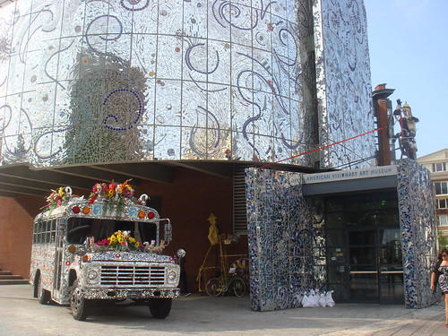
AVAM, Baltimore

The American Visionary Art Museum
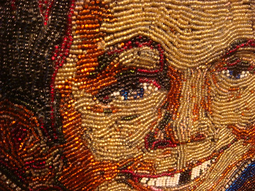
Alfred E. Neuman
Smile Dress
Last Will and Testament

Between the earthquake and the hurricane, I managed to make it out to the American Visionary Art Museum in Baltimore late last week. Lots of amazing work there and lots to think about. Their current exhibition What Makes Us Smile? was full of happy-sad work by a wide range of individuals, from outsider artists to Patch Adams, M.D. I loved the beaded Alfred E. Neuman headboard by Patty Kuzbida. It was also a unique pleasure to see the work of a Toronto friend in a huge museum show in a totally different city-- Rev. Aitor of The Misanthrope Specialty Co. had some of his infamous Unflattering Portraits in the show, and seeing them there was like seeing a familiar (ugly) face in a crowd of strangers.

After seeing the exhibition, Ben said that it was great that a museum like this exists because the things on display were "things he would have wanted to make when (he) was a kid." In saying this, he was referring to art made out of salvage, and a huge model boat made out of toothpicks (!) in particular. In so many words, I think he was implying that the work at the AVAM might encourage people to make things just for the sake of making them or follow a creative impulse that might initially seem odd or "pointless." This is an important thing for artists to keep in mind too-- there is nothing wrong with just making for the sake of making, or doing something "just because you want to." After all, experiments are the mothers of invention.

Saturday, July 16, 2011

Heir/Looms


Here is a sneak preview of an exhibition I'll be taking part in next month in Montreal. Thanks to Nicole Dawkins for including me!
More info on Heir/Looms to come soon.

www.heirloomsexhibit.tumblr.com

Saturday, June 25, 2011

Moon Man Newfie

Noofaland
Noofaland

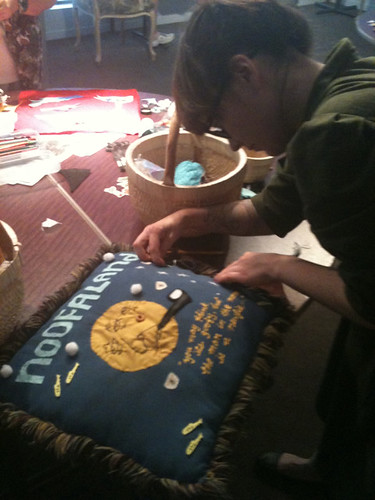
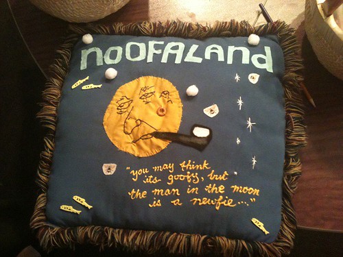
Here are some cell phone photos of me and my souvenir pillow-in-progress made at a workshop this afternoon at the Textile Museum of Canada. The workshop was held today by Andrew Hunter of the collaborative art duo, Dodolab. This pillow is inspired by the province of my forefathers and mothers (Newfoundland!) as well as the Stompin' Tom song, "Moon Man Newfie" and various NFLD culinary oddities. This weekend's workshops are a part of the TMC's newest exhibition, Cold Comfort: New and Improved Souvenirs of Canada. It's amazing-- go check it out!

Photos: Andrew Hunter

Friday, June 24, 2011

Catching Up

opening11

I am very behind on this blog! My only excuse is that I'm one month into a summer job that requires me to spend a very long time on a computer-- something far from the retail reality I was so used to one short month ago. By the time I get home, I would rather not type another word! There is plenty to catch up on, but for this post I'll just concentrate on the two (wonderful and super noteworthy) shows I have work in right now.

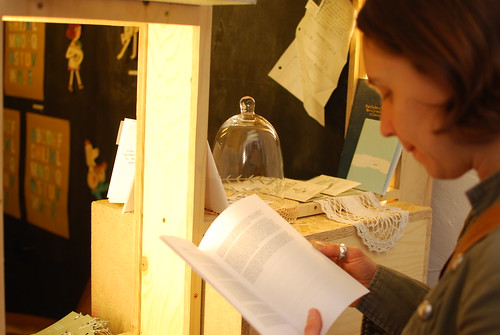
The above photograph is of my corner of a little world known as The Wunderkabinet-- a roving series of exhibitions in Kreuzberg, Berlin curated by the talented Leah Buckareff. This is my third Wunderkabinet exhibition, and in some ways the premise of this third exhibition-- The Reading Raum-- is the one that is closest to my heart. Housed in a wacky architectural storage unit called The Turtle in the Etsy Labs Berlin space, The Reading Raum is an archive and exhibition of mini-books, zines and printed matter. Much like a zine library, people are encouraged to peruse the books and linger, and they even have the option to purchase many of the items on display. I loaned a heap of work to the show and if the photographs of the opening on Leah's Flickr page are any indication, it looks like the show was very well recieved when it opened. Congrats Leah, and thanks again for including me!

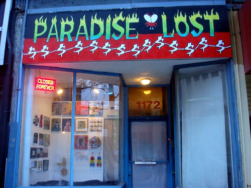
Paradise Lost

Secondly, I am one of the 49 artists included in Paradise Lost-- the very last exhibition at Fly Gallery, a long-running and much loved window gallery on Queen Street West. The following is text from the press release put out by Tanya Read and Scott Carruthers, proprietors of Fly Gallery:

After 12 years Fly Gallery is packing it in. Our mandate has been to keep art accessible and contribute to the cultural life of the street. Since 1999 the development of this stretch of Queen St. has changed the dynamic of that culture. One may call this development ‘Gentrification’. Often associated with negative connotations it is a reality of many urban neighbourhoods. Whether the development is a good or bad thing, it is a factor in why Fly is leaving Queen West. Is this Paradise Lost or a new beginning? The spirit of Fly will live on and we have invited artists to say goodbye with us.

I had my very first art show at Fly Gallery in 2005, and I ended up showing there twice more in 2006 and 2008. Fly was instrumental in bringing art to the Queen Street strip and providing people with spontaneous and often playful encounters with art in their daily lives. It was immeasurably valuable as a truly accessible art gallery-- a rare breed in this day and age. I'll miss it dearly! Happy trails, Tanya and Scott!

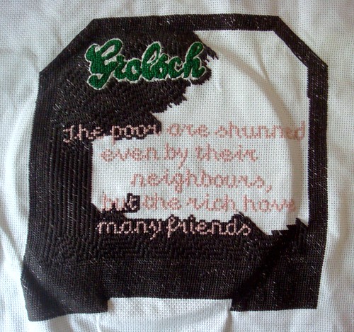
Proverb For Queen Street West

This is a photo of my piece for Paradise Lost while it was in progress. "The poor are shunned even by their neighbours, but the rich have many friends" is a proverb from the Old Testament. I chose it because I felt like it succinctly summed up my view of what has been happening on Queen West for the past five or six years. While the tone of this proverb may seem a little snippy, I admire Tanya and Scott for taking the opportunity to move forward and start anew.

Paradise Lost is up at Fly Gallery-- 1172 Queen Street West-- until August 13, 2011.

Photo Credit (Top): Ina Gollmann

Wednesday, June 08, 2011

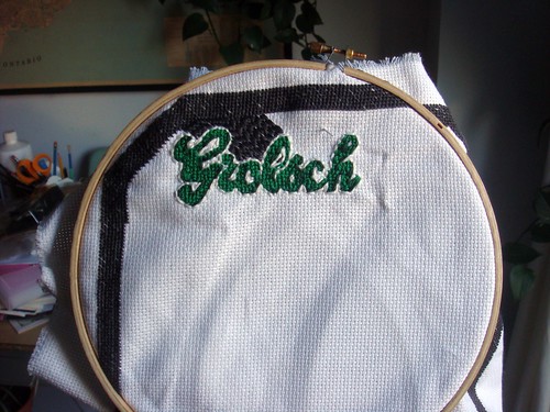
Beer-broidery

Beer-broidery

So far so good! I still have lots to do, though. It has to be done by June 18th.

Monday, May 23, 2011

Sandwich Board

Sandwich Board
Sandwich Board
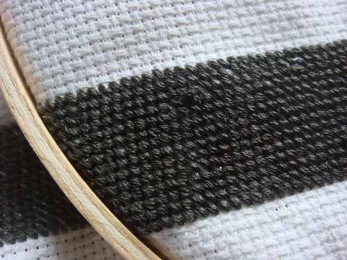
The beginnings of what will be a pretty intense cross-stitch project. This piece will (hopefully, if it turns out well!) end up in Toronto window gallery institution Fly Gallery's very last show, Paradise Lost, which will run from late June until the end of July.

More on this project as it starts to take shape.

Friday, May 13, 2011

School Jerks EP on Art 4 Punks Blog

Day Two:  The Saga Continues

Not much to report these days-- is it possible that I'm experiencing the dog days of summer in May? I've felt oddly bored and paralyzed lately, as though I've been hit by some form of post-school narcosis.

A few weeks ago the School Jerks EP got a nice mention on a blog that I follow out of LA called Art 4 Punks. Thanks for the props, Paul! Take a look at A4P for a peek at some of the more interesting examples of punk and hardcore record art from this side of 1981.

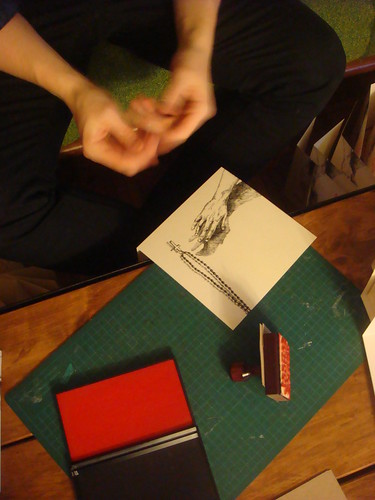
Here is a funny peek at the process of making the record covers. Ben spent two nights hand stamping 1000 covers in our living room as I (for the most part) watched on in amusement/amazement. While part of me isn't as happy with the overall result of this record over the previous one, it's still pretty awesome and there's been some nice feedback about it.

Stamping

Monday, May 02, 2011

B'More or Bust


It's official. I'm relocating to Baltimore for 4 months in September to attend MICA. Land of crab cakes and Hairspray. Holy crap!

Thursday, April 28, 2011

Three Towers

Radio Tower
Hometown
Loveless Town
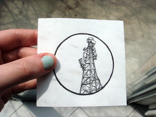
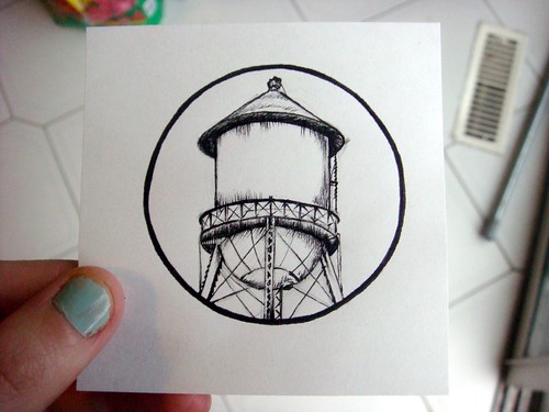
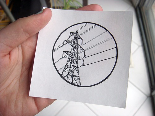
These are three pin designs I drew two days ago for my pals, the Modern Superstitions. Text will be added which will also be hand-drawn, and it looks like we'll only be using the bottom two after all-- the water tower and the hydro tower.

Modern Superstitions are the easiest band to do artwork for-- it is always a huge pleasure. The main reason for this is that both their lyrics and music are so damn evocative. The idea of bell towers and clock towers immediately came to mind when I first listened to the songs on their last EP. We ended up going with a stained glass motif as a slight variation on those ideas, but I was able to work with towers in this pin project, which I'm grateful for. These towers are definitely less majestic and more mundane and "local" feeling, which matches some of their songs and lyrics this time around-- Hometown, Loveless Town, etc.

The hydro tower is an ode to my own hometown, Scarborough (incidentally, also a loveless town!). The water tower is an icon associated with more rural hometowns. The idea is that the hydro tower pin be silver, and the water tower be a bronzy gold...we'll see if everything works out as planned!

Sunday, April 24, 2011

Sweetie Pie Press Tour Fundraiser


Only three days to go. Take a look at this video, get inspired by Becky's amazing life and activities, and DONATE.

All the details can be found on Becky's Kickstarter page.

Friday, April 22, 2011

Easter Eggs

Easter Eggs
Easter Eggs
Easter Eggs
Easter Eggs
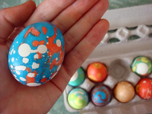
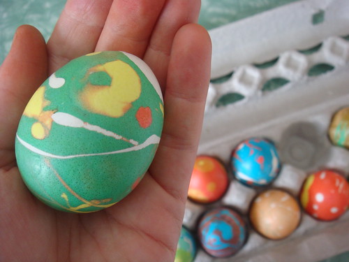
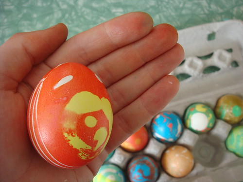
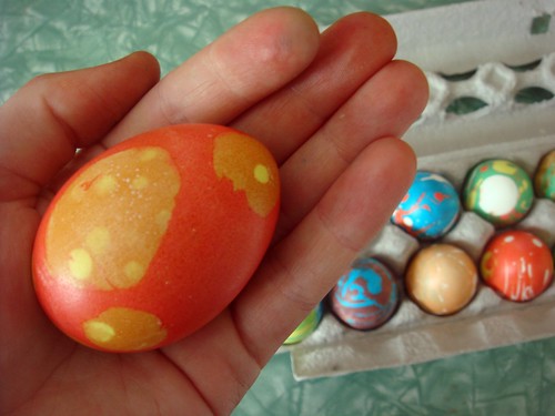
Dyed some easter eggs today using wax. These are some of my favourites.

Thursday, April 21, 2011

Mushroom and Butterfly


This was my final project for a sculpture class this year. Would you believe the course was called Nature, Transformation and Change? Leave it to OCAD to infuse a course about nature with computer processes and trends in technology. Even though I don't "feel like myself" having done this project-- some of these ideas felt like a bit of a stretch for me-- I did enjoy the process, and have been meaning to work with sound for a while. I realize reading about this project won't be everyone's cup of tea, but read on if you feel so inclined.

Mushroom and Butterfly

Mushroom and Butterfly is an artistic experiment centred around two audio recordings and their corresponding audio waveforms. The name of the project comes from the two forms popped corn can take, the butterfly and the mushroom. This project is an extension of my last project, which used popcorn kernels as raw material for a public art intervention that explored genetically modified organisms and the corporate mediation of our collective experiences of food.

This project was also inspired by recent research I conducted for completely different projects. After researching the work of contemporary artist and experimenter Natalie Jeremijenko, I became interested in her projects that explore unlikely forms of data visualization such as tree growth and digital printer viruses. In writing a completely different paper on a Canadian abstract painter from the 1930s named Bertram Brooker, I became interested in a condition he experienced called synesthesia-- a neurological condition where one sensory or cognitive pathway leads to an involuntary secondary sense or cognitive pathway. In other words, synesthesia involves an inexplicable intersection of two or more senses. For example, some people who experience synesthesia might associate certain numbers with certain colours, or identify certain letters as either masculine or feminine. Bearing this in mind, I was interested in how senses can be combined to conduct investigations guided by intuition. For this project in particular, I used both sound and data visualization in an attempt to examine the inherent differences between genetically modified corn kernels and organic corn kernels.

Natalie Jeremijenko-- one source of inspiration for this project-- is a contemporary artist who has worked extensively with nature, and has explored both analog and digital forms of data visualization. In her project Onetrees (1998-2003), Jeremijenko planted one thousand clone trees across the San Francisco Bay Area. While these trees are genetically identical, their growth and development over time serves as an indicator of the social and environmental differences of each site they were placed in. This project, as such, could be thought of an unconventional method of data visualization. The projects A-Trees and Stump are computer art works related to the greater Onetrees project. A-Trees are virtual trees that allow people to monitor the growth of a virtual tree on the desktop of their personal computer. The A-Trees software includes a real-time carbon dioxide sensor, causing the virtual tree to either thrive or suffer according to the amount of CO2 in the immediate vicinity of the computer. Similarily, Stump acts as a re-imagining of more conventional forms of data visualization, giving form to what the Onetrees website refers to as “tree debt." According to the website:

(Stump is a) printer queue virus that counts the number of pages consumed by the printer. When the equivalent of a tree in pulp has been consumed the program automatically prints out a slice of tree. Accumulating these pieces of paper ‘grows’ a stump of the forest that you and your printer have consumed, and a tangible representation of tree debt."

For my own project Mushroom and Butterfly, I was interested in exploring the inherent differences between GM and organic popcorn kernels, and whether or not the two types of kernels would “behave” differently when popped. I have very little experience using technological or computer-based processes in my work, and decided to use audio recording both because I have a working knowledge of some recording software, but also because audio recording seemed like a somewhat nonsensical and very unlikely lens with which to envision the properties of genetically modified and organic foods. My process entailed my positioning my laptop next to my stovetop. I recorded the popping sounds of both the GM and organic popcorn using the Mac recording program GarageBand, starting and stopping the recording from the first popped kernel to the point when the kernels finally finished popping. The results of the recording were two audio recordings, and the accompanying audio waveforms. While the recordings could be considered pieces of readymade sound art in themselves, the audio waveforms act as a form of visual data that clearly illustrates the differences between the behavior of both bags of popcorn. For example, the organic corn waveform reveals that it finished popping faster overall, and the quality of it’s popping reads on the waveform as louder and longer clusters of multiple pops, with an irregular rhythmic quality. On the other hand, the genetically modified popcorn’s waveform is quieter, with a less vigorous yet highly surprisingly regular rhythmic quality. While such a hypothesis could never be considered truly scientific on account of subtle differences in cooking temperature, freshness and ingredients, the audio waveforms from the two recordings seem to indicate that GM popcorn behaves more regularly than organic popcorn.

While the viability of my findings through this experiment many not convince anyone that I’ve discovered anything profound about the differences between genetically modified and organic corn as evidenced through popping sounds, I do think there is value to experiments such as this one. In particular, I think there is potential for audio waveforms to serve as a method of reading and measuring information outside of the sphere of music. While this may be far from uncharted territory, I would be interested in exploring these ideas in greater depth in future projects.

Bibliography

“Onetrees: An Information Environment.” Xdesign/Natalie Jeremijenko Website. New York University. 30 March 2011

Sardar, Zahid. “Society’s Signposts: Natalie Jeremijenko’s Trees Aren’t Simply Decorative-- They Can Be Read Like a Social Register.” San Francisco Gate/sfgate.com. October 23rd, 2004. 30 March 2011

“Synesthesia.” Wikipedia. 13 April 2011

Tribe, Mark and Jana, Reena. “A-trees: Natalie Jeremijenko.” New Media Art. Edited by Uta Grosenick. Cologne, Germany: Taschen 2009. 48-9 (print)

Monday, April 11, 2011

The Thomson Collection


While it is somewhat fashionable to poo-poo the Art Gallery of Ontario's Thomson Collection-- Ken Thomson was largely responsible for funding the AGO's renovation, and his extensive collection of European and Canadian Art was donated to the gallery after his death-- after doing a fair bit of research on it for a paper, I can honestly say I am a big fan. The European Collection in particular is home to some very eccentric sculptural gems-- the sorts of things that would belong to a flamboyant uncle with black humour who travels a lot. The above images are some of my favourites. They are courtesy of the AGO's Art of the Day tumblr page.

From Top:

Rosary Pendant: Death Mask and Skull Eaten by Worms and Lizards
Northern France or Southern Netherlands
1500-1525
ivory, polychrome

Allegory of Youth and Death
German (Augsburg or Munich)
early 17th century
ivory, 7.3 x 22.6 x 9.4 cm

Death Triumphant
German (Bavaria?)
around 1670
lindenwood, 24.0 x 13.5 x 7.5 cm

Skull Pendant with Entombed Skeleton
British or Dutch
17th century
gold, enamel, diamonds, 1.4 x 1.2 x 3.4 cm

Thursday, April 07, 2011

The Twilight Zone, The Uncanny Valley and Rod Serling on Creativity


I've been at home with the stomach flu for the past three days. I have a ton of work piling up around me, but all I can bring myself to do is watch episode after episode of The Twilight Zone on Youtube. I have been a fan of TZ for as long as I can remember, but I've fallen back into love with Rod Serling and TZ in a big way recently. Here is an amazing picture taken during the production (I'm guessing?) of my all-time favourite episode, The After Hours, which involves mannequins coming to life, and a hidden floor of a shopping mall. Also, the episode was shot in 1960, and the episode's lead (pictured on the left, with her mannequin double on the right) looks exactly like the first Barbie doll, that would have been released less than a year earlier in 1959.

This photo also reminds me of a theory I learned about recently called the uncanny valley. It is a robotics theory that determines at what point humans become repulsed or "creeped out" by robots that look like humans. I would say that the mannequin definitely sits in range of the uncanny valley, without making the episode remotely unwatchable.

Not entirely unrelated, here is a video of Rod Serling in the late 60s or early 70s speaking with students about writing for television, specifically about creativity and working with ideas. Everything he says could be applied to making visual art too, and it's all fine advice, even if at times it is a little "dad-like." I believe my own father said "if it wasn't hard, everyone would do it" to me at some point within the past month...!