Friday, March 25, 2011
Psychedelic Album Art
I once joked that I can tell how awesome an album is going to be based on how illegible the album's title is on it's cover. If this sounds weird, it's because most of the albums I consume are from the psychedelic era. Here are some examples of records from my collection with totally over-the-top cover art and creative (if completely unreadable) examples of typography. This post is probably inspired by my recent review of the work of Marian Bantjes, who has admitted to being influenced by the art and design of the late 60s.
From the top:
The Incredible String Band, The Five Hundred Spirits or The Layers of the Purple Onion (Elektra, 1967)
SRC, Self-titled (Capitol, 1968)
Elyse, Self-titled (Tetragrammaton, 1968)
Pisces, A Lovely Sight (Reissue on Numero Group, 2009)
The Tiffany Shade, Self-titled (Mainstream, 1968)
Wednesday, March 23, 2011
Marian Bantjes Review on TCA
A review I wrote of the Marian Bantjes exhibition was just posted on Toronto Craft Alert. Check it out here.
For more information on the show at Onsite (at) OCADU, check out these websites:
http://www.ocad.ca/onsite
http://iwonderbantjes.tumblr.com/
Sunday, March 20, 2011
Corn Maze Performance

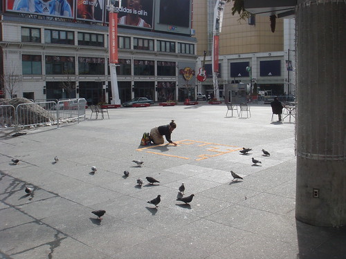
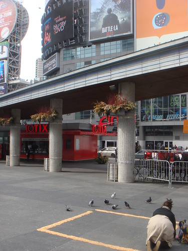
Last week, I did a performance at Dundas Square with popcorn kernels. I confess, this was an assignment for the one studio class I am taking in school this year, called Special Focus Studio: Nature, Transformation and Change. The assignment simply required that we make a piece of work that references ecological art, bio art, and uses "light, weather, animal, vegetable or mineral" as material for a work of art. Pretty familiar territory for me, I'd say!
My idea was to continue in the vein of the last piece of work for this class-- it involved a proposal for a piece of public art using cast Iroquois longhouse/greenhouse hybrid forms as a basis for three bronze sculptures across from a cluster of highrise buildings in my old neighbourhood in Scarborough. The project was rooted in ideas about urban food insecurity. I was also thinking about recent work I've done with cornsilk, specifically the corn maze quilt square I made for the Greenbelt Foundation Quilt Project, sponsored by the Ontario Craft Council. This is the short write up I did about my square, for the project's catalogue:
Corn Maze is a representation of an aerial view of a corn maze made out of the corn silk of Ontario-grown corn. Corn mazes, like berry picking, are attractions commonly linked to agritourism or “agritainment.” As a city-dweller, my experiences of the Greenbelt growing up were limited to such forms of contact with rural life. Similarly, as an adult my connection to rural Ontario is almost entirely limited to my consumption of locally grown produce. Corn Maze pokes fun at my unabashedly urban relationship with Ontario’s countryside.
In doing further research on corn mazes, I came across photos of a number of corn/hedge mazes that served as enormous advertisements for McDonalds, Husky and Chevrolet, meant to be seen aerially. To me, these rather perverse advertisements served as an apt metaphor for the omnipresence of corporate interests in the realm of food, from agriculture to food retail and brand power. Corporations mediate out experiences with food-- it is disturbing to think that such a vital, elemental part of our lives is essentially constructed and informed by corporate interests.

I knew that I wanted to make an installation in a public space that used the idea of a corn maze as it's framework. My objective was to make make a physical manifestation of this dichotomy of food experience as natural, nourishing, visceral and personal while also highly mediated. I also was thinking about the ideas surrounding my original Corn Maze quilt square-- in an urban environment, our experiences of food involve us purchasing it as opposed to growing it. How might one reconcile this distance from food's original source-- the farm, the earth-- through a performative gesture? Deciding on the right site was really important to the performance. After briefly considering laying a Corn Maze out in the parking lot of the Liberty Village location of Metro (where I do most of my grocery shopping), I decided that Dundas Square would be the best site due to it's proximity to so many billboards, signs, and for the square's general sense of insane media barrage.

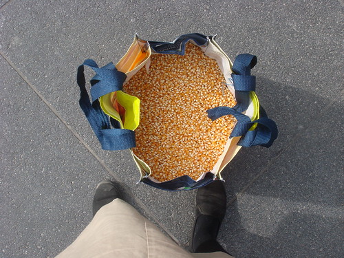
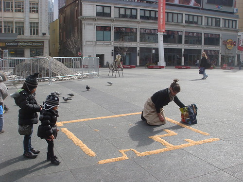
So, for my performance I made a corn maze-- modelled after a corn maze drawing I did with corn silk on Kozo paper just under a year ago-- on the ground. It ended up being about 10' X 10' large. I used a Metro reusable shopping bag to carry about 30 lbs of kernels to Dundas Square...it was insanely heavy! Being on my hands and knees for an hour was no easy task either, but the pain was eased slightly by the fact that many passers by stopped to look and chat as I was working. Children tidied my stray kernels as I worked and distracted hungry pigeons by feeding them breadcrumbs. One man-- who was awesome, and helped me clean up all my kernels with a shovel when I was done-- told me about how what I was doing reminded him of his wedding in the Philippines where coconut leaves were laid out in patterns on the ground as part of the ceremony.

There is a little more to this piece and my research for it than I will write about here. I did a bit of research on GMOs and the artwork of Costa Rican artist Lucia Madriz, who does artwork with staple foods such as corn, beans and rice. I also learned about some interesting parallel practices that are related to my installation, such as Navaho and Tibetian Sand Painting, as well as the Indian practice of Kolam, which is essentially sand painting with rice powder in order to invite birds and small insects and animals into the home in order to pay tribute to the harmonious co-existence of humans and animals. All in all, making this installation was a great experience, and it has provided me with a number of ideas for more work with corn...work that will be a little easier on the knees, at that!
More pictures of the performance can be found on my Flickr page. All photos by B. Needham. Thanks, Bo!
Saturday, March 19, 2011
School Jerks 3rd 7"
This glorious recorded artifact of the hardcore punk persuasion came out about a month ago, and the cover drawing is by yours truly. I hand-stamped the logo on about 200 of the 1000 copies that were made, too.
School Jerks' myspace can be found here.
Wednesday, March 09, 2011
Joni Mitchell Draws on the CBC, 1967
Joni talks negative and positive space with the hosts, and does a pretty groovy drawing. This is one of many very fun CBC RetroBites, scooped off of the CBC's Youtube channel.
Sunday, March 06, 2011
Marian Bantjes
Marian Bantjes is an exceptionally talented and creative designer and typographer from British Columbia. She has an exhibition up right now at Onsite (at) OCAD, that I can't recommend enough. The exhibition is at least in part in honour of her new book, I Wonder.
For more info on Bantjes, check out her website.
For more info on her OCAD exhibition, look at this.
Subscribe to:
Comments (Atom)


